Luxembourg, Death rates (period 1x1),   Last modified: 09 Aug 2023;  Methods Protocol: v6 (2017)

  Year          Age             Female            Male           Total
  1960           0             0.023863        0.039607        0.031891
  1960           1             0.001690        0.003528        0.002644
  1960           2             0.001706        0.002354        0.002044
  1960           3             0.001257        0.002029        0.001649
  1960           4             0.000844        0.001255        0.001051
  1960           5             0.000873        0.001701        0.001293
1960 6 0.000443 0.000430 0.000437Moving Beyond Linearity
ACTL3142 & ACTL5110 Statistical Machine Learning for Risk Applications
Some of the figures in this presentation are taken from "An Introduction to Statistical Learning, with applications in R" (Springer, 2013) with permission from the authors: G. James, D. Witten, T. Hastie and R. Tibshirani
Overview
- Linearity & Nonlinearity
- Data Science Starts With Data
- Linear Regression
- Polynomial Regression
- Step Functions
- Regression Splines
- Smoothing Splines
- Local Regression
- Generalised Additive Models (GAMs)
Reading
James et al. (2021): Chapter 7
Linearity & Nonlinearity
Lecture Outline
Linearity & Nonlinearity
Data Science Starts With Data
Linear Regression
Polynomial Regression
Step Functions
Regression Splines
Smoothing Splines
Local Regression
Generalised Additive Models (GAMs)
Nonlinear curves
The legend of the Laffer curve goes like this: Arthur Laffer, then an economics professor at the University of Chicago, had dinner one night in 1974 with Dick Cheney, Donald Rumsfeld, and Wall Street Journal editor Jude Wanniski at an upscale hotel restaurant in Washington DC. They were tussling over President Ford’s tax plan, and eventually, as intellectuals do when the tussling gets heavy, Laffer commandeered a napkin and drew a picture. The picture looked like this:
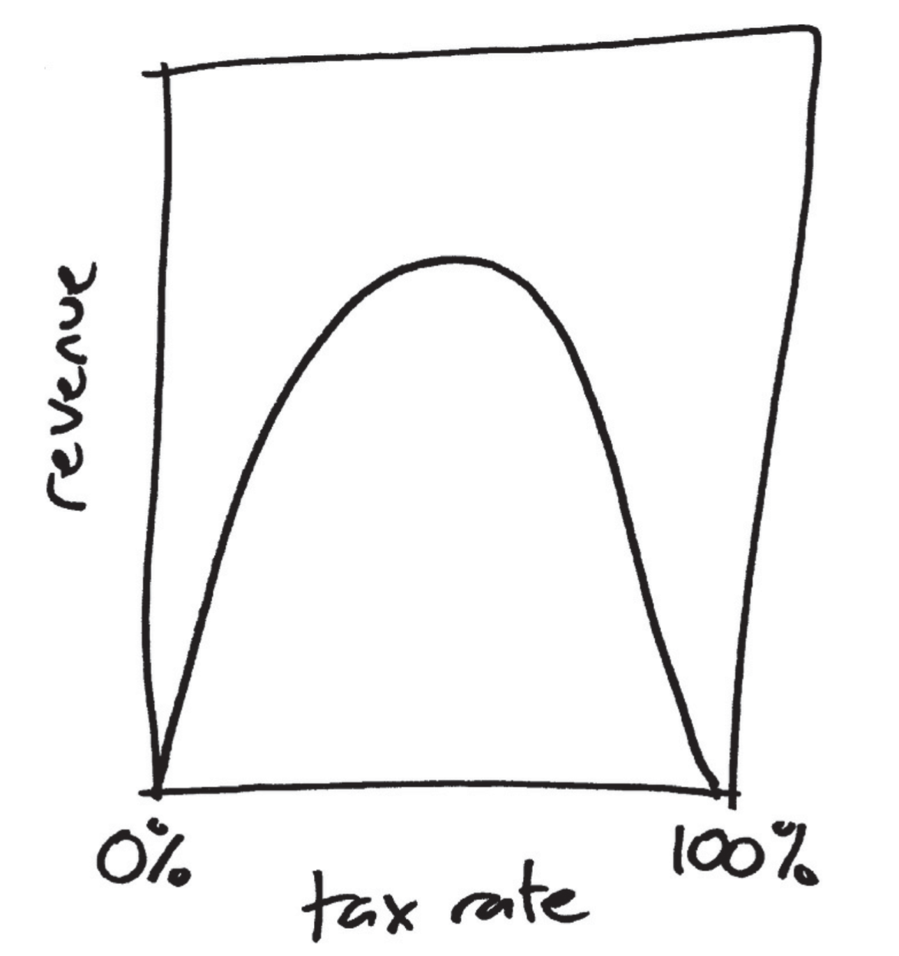
Source: Jordan Ellenberg (2014), How Not to Be Wrong: The Power of Mathematical Thinking
One predictor vs multiple predictors
\texttt{sales} \approx \beta_0 + \beta_1 \times \texttt{TV}
\texttt{sales} \approx \beta_0 + \beta_1 \times \texttt{TV}+ \beta_2 \times \texttt{radio}
Source: James et al. (2021), An Introduction to Statistical Learning with Applications in R, Figures 3.1 & 3.5.
By the end of today
We’ll focus on one predictor and one response variable for most of this lecture.
Source: James et al. (2021), An Introduction to Statistical Learning with Applications in R, Figures 2.4 & 2.6.
Moving beyond linearity
Using a term like nonlinear science is like referring to the bulk of zoology as the study of non-elephant animals. (Stanisław Ulam)
- Linear models are highly interpretable, but can be very unrealistic.
- Ideally, we would want interpretable nonlinear models. But, from a machine learning view (not a statistical view), we care more about predictions.
- Here we cover:
- Polynomial regression
- Step functions
- Regression splines
- Smoothing splines
- Local regression
- Generalised additive models
In-class demonstration
Some mystery data
Instructions
I want you to ‘fit’ the data four different ways by drawing:
Top left: a straight line
- Draw a single straight line
- Don’t lift your pen from the page
Bottom left: a step function
- Draw a sequence of flat lines
- Lift your pen between each line
Top right: a quadratic curve
- Draw a single smiley-face curve
- Don’t lift your pen from the page
Bottom right: a smooth curve
- Draw a single curve of any shape
- Avoid jagged changes of direction
Data Science Starts With Data
Lecture Outline
Linearity & Nonlinearity
Data Science Starts With Data
Linear Regression
Polynomial Regression
Step Functions
Regression Splines
Smoothing Splines
Local Regression
Generalised Additive Models (GAMs)
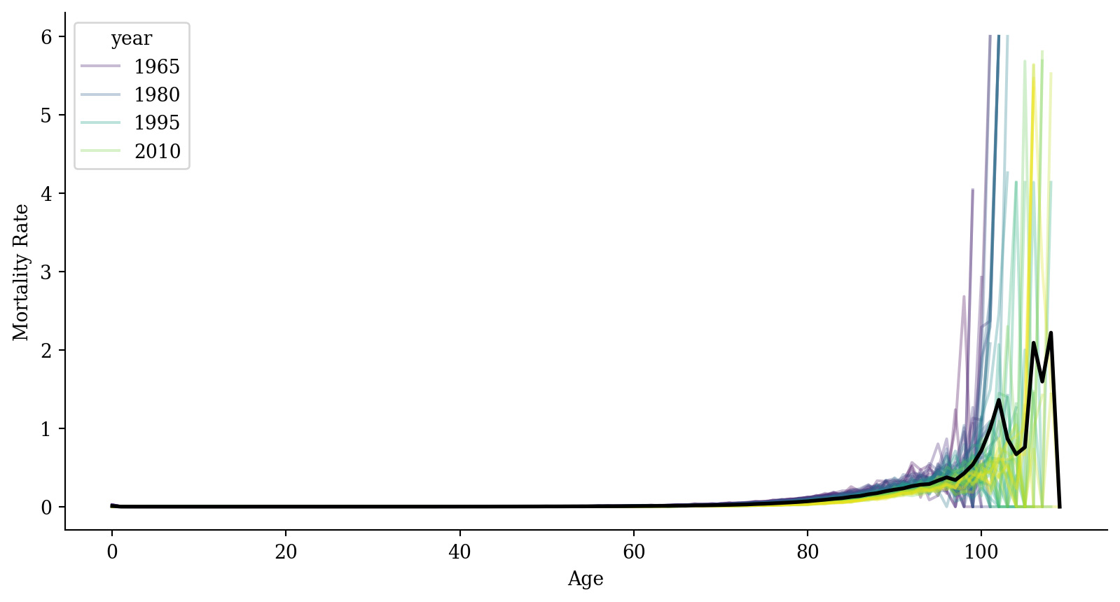
Luxembourg Mortality Data
Download a file called Mx_1x1.txt from the Human Mortality Database.
No-one is allowed to distribute the data, but you can download it for free. Here are the first few rows to get a sense of what it looks like.
Setup & importing the data
lux = pd.read_csv('Mx_1x1.txt', sep='\s+', skiprows=2)

lux = lux.rename(columns={'Age': 'age', 'Year': 'year', 'Female': 'mx'})
lux = lux[['age', 'year', 'mx']]
lux = lux[lux['age'] != '110+'].copy()
lux.loc[lux['mx'] == '.', 'mx'] = np.nan

lux['year'] = lux['year'].astype(int)
lux['age'] = lux['age'].astype(int)
lux['mx'] = lux['mx'].astype(float)

lux
age year mx
0 0 1960 0.023863
1 1 1960 0.001690
2 2 1960 0.001706
3 3 1960 0.001257
4 4 1960 0.000844
... ... ... ...
6987 105 2022 0.661481
6988 106 2022 5.419704
6989 107 2022 NaN
6990 108 2022 NaN
6991 109 2022 NaN
[6930 rows x 3 columns]Mortality
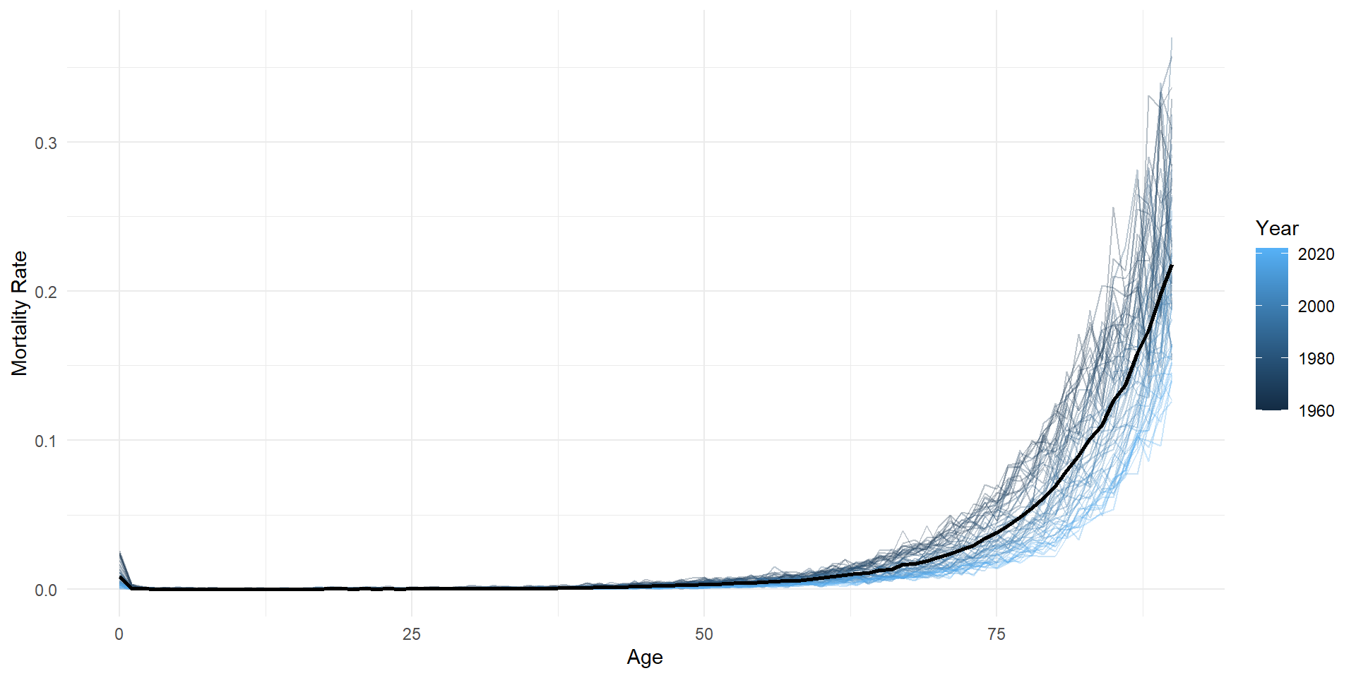
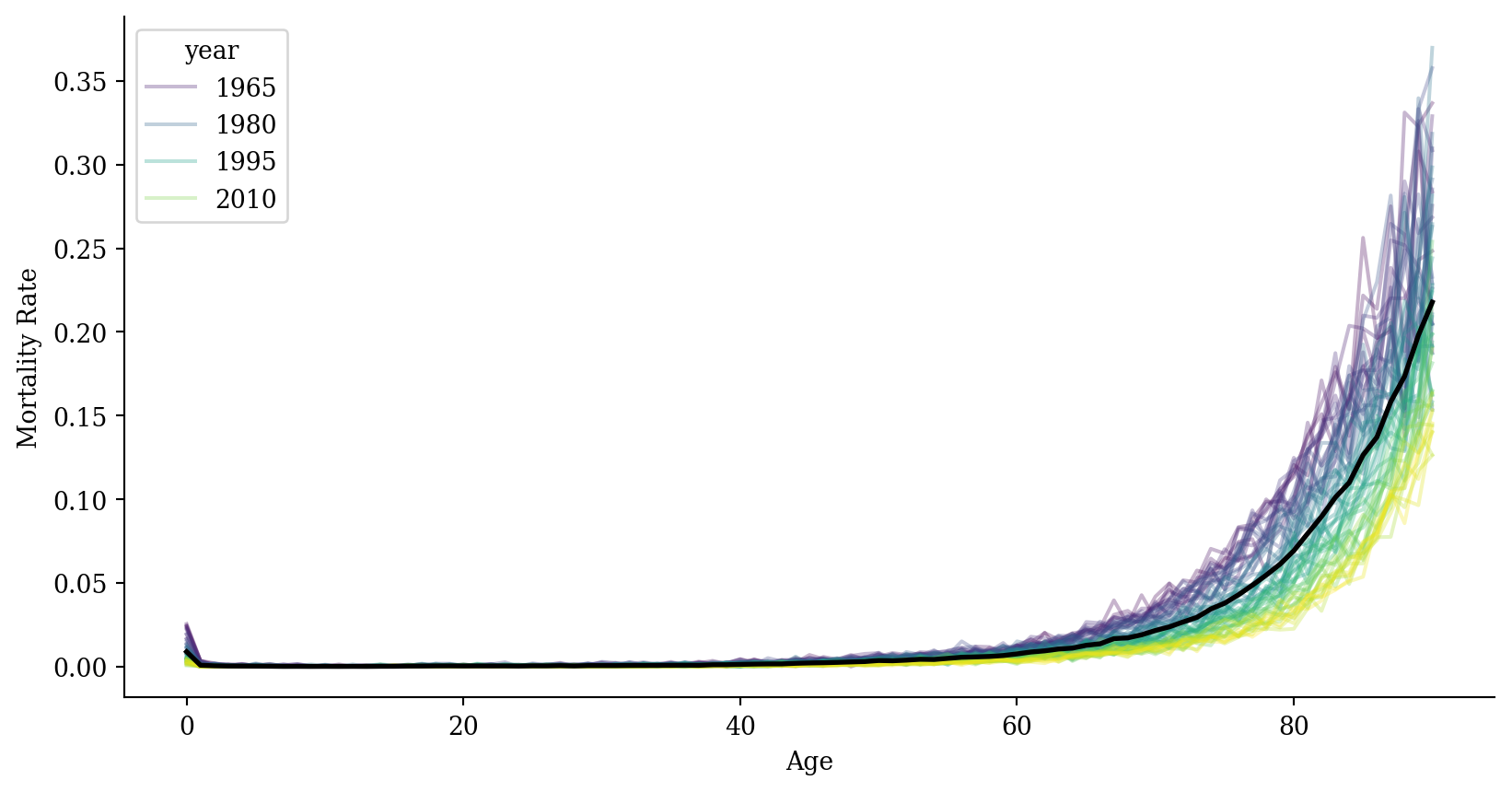
Code
average_df <- lux %>% group_by(age) %>% summarise(mx = mean(mx, na.rm = TRUE))
ggplot(lux, aes(x = age, y = mx)) +
  geom_line(aes(group = year, color = year), alpha = 0.3) +
  geom_line(data = average_df, color = "black", linewidth = 1) +
  labs(x = "Age", y = "Mortality Rate", color = "Year") +
  theme_minimal()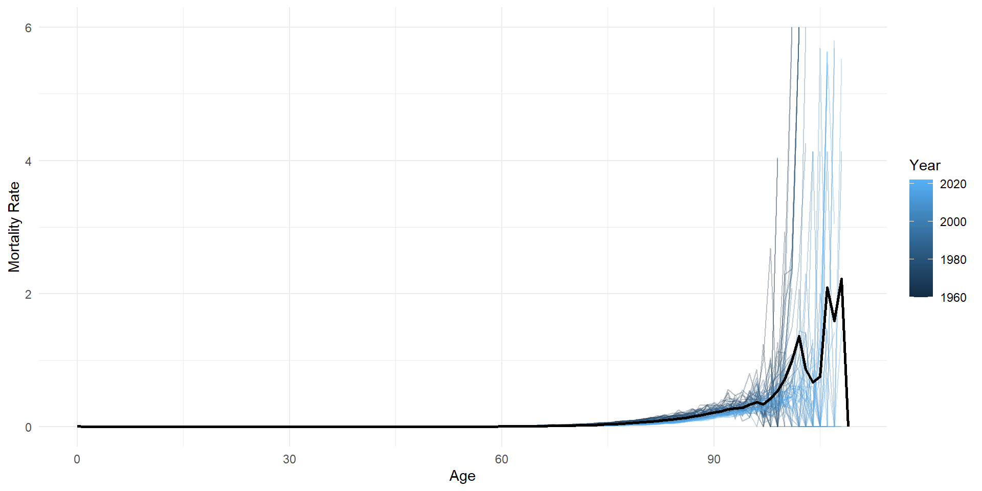
Mortality (zoom in)
Log-mortality
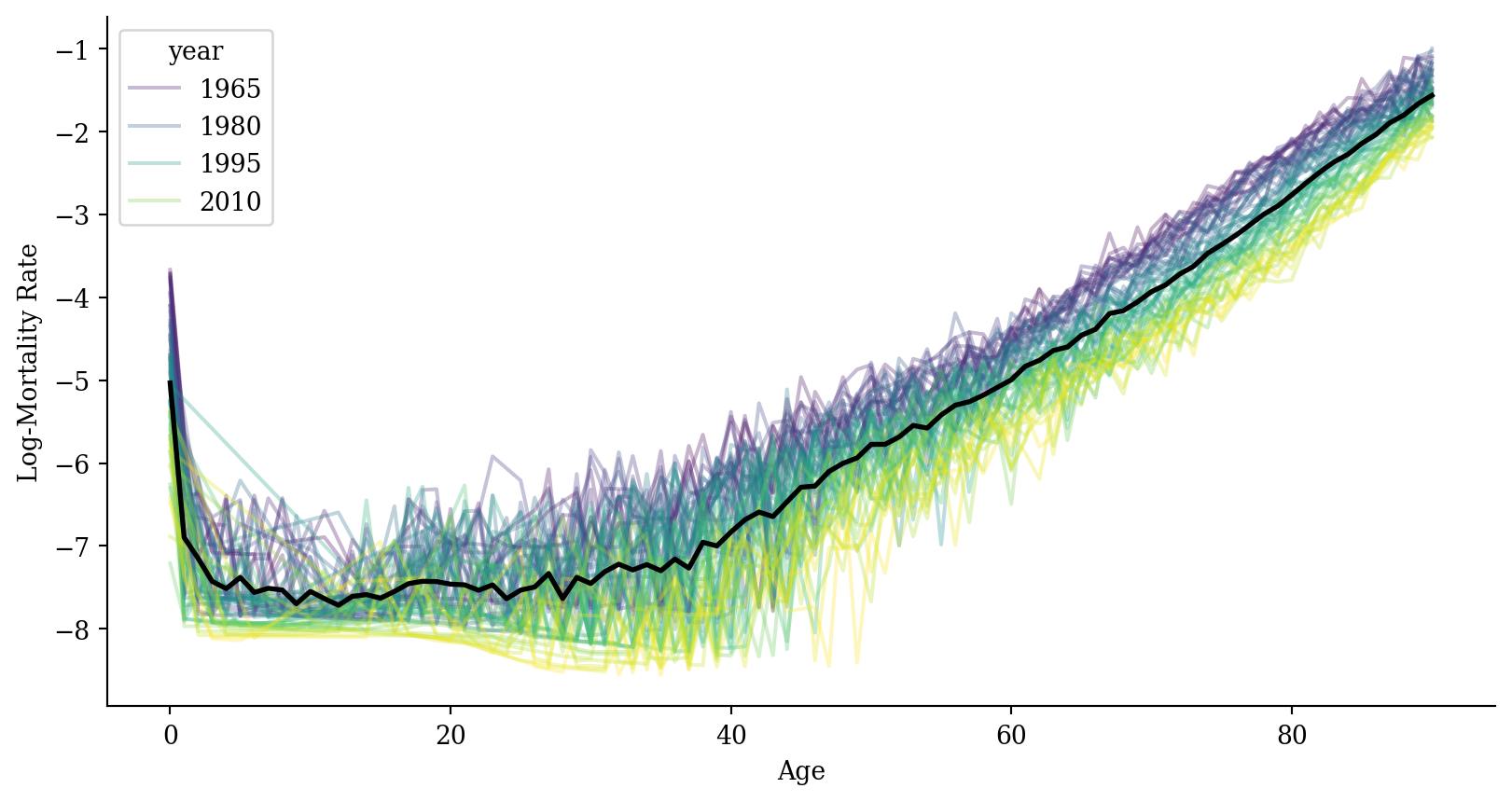
Code
average_df <- average_df %>%
  left_join(lux %>%
              group_by(age) %>%
              summarise(log_mx = mean(log_mx, na.rm = TRUE)),
            by = "age")

ggplot(lux, aes(x = age, y = log_mx)) +
  geom_line(aes(group = year, color = year), alpha = 0.3) +
  geom_line(data = average_df, color = "black", linewidth = 1) +
  labs(x = "Age", y = "Log-Mortality Rate", color = "Year") +
  theme_minimal()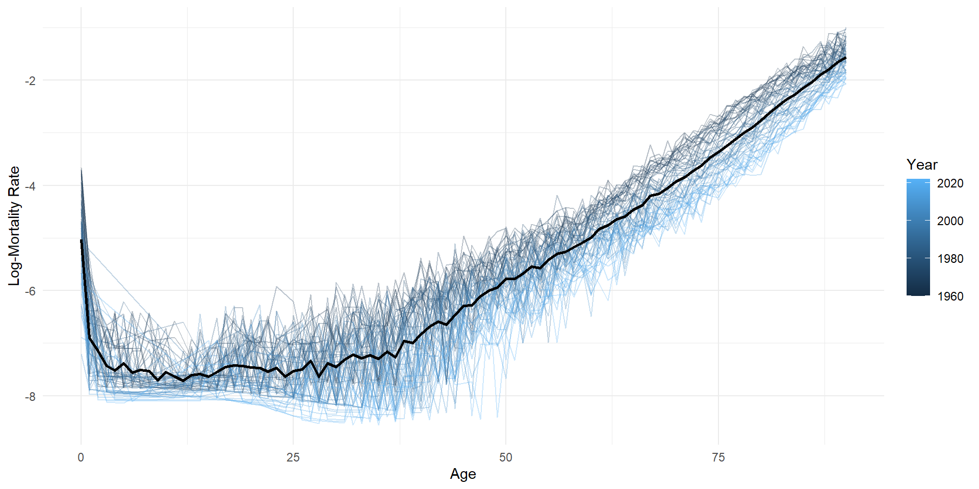
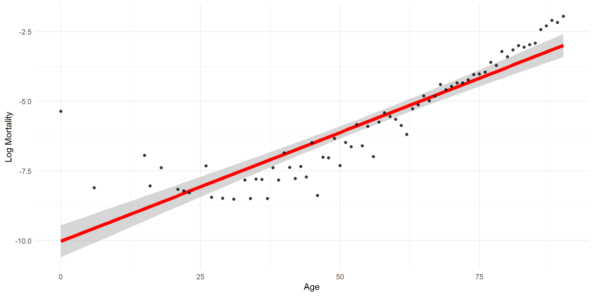
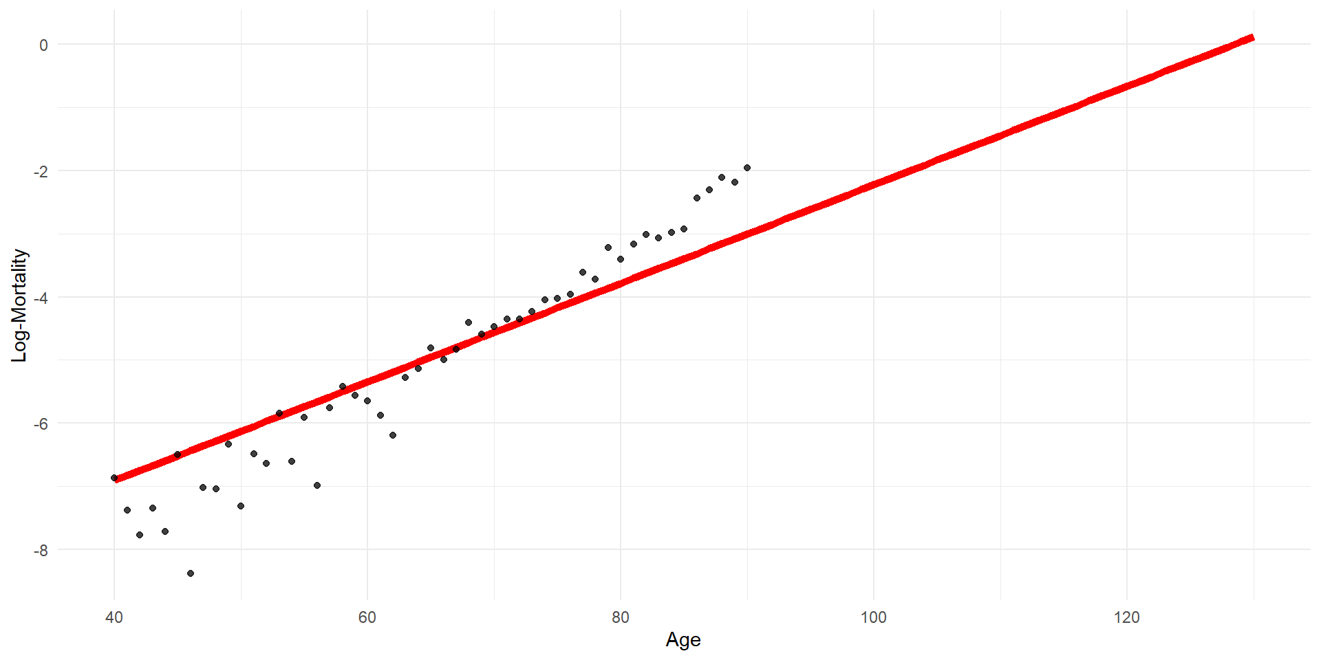
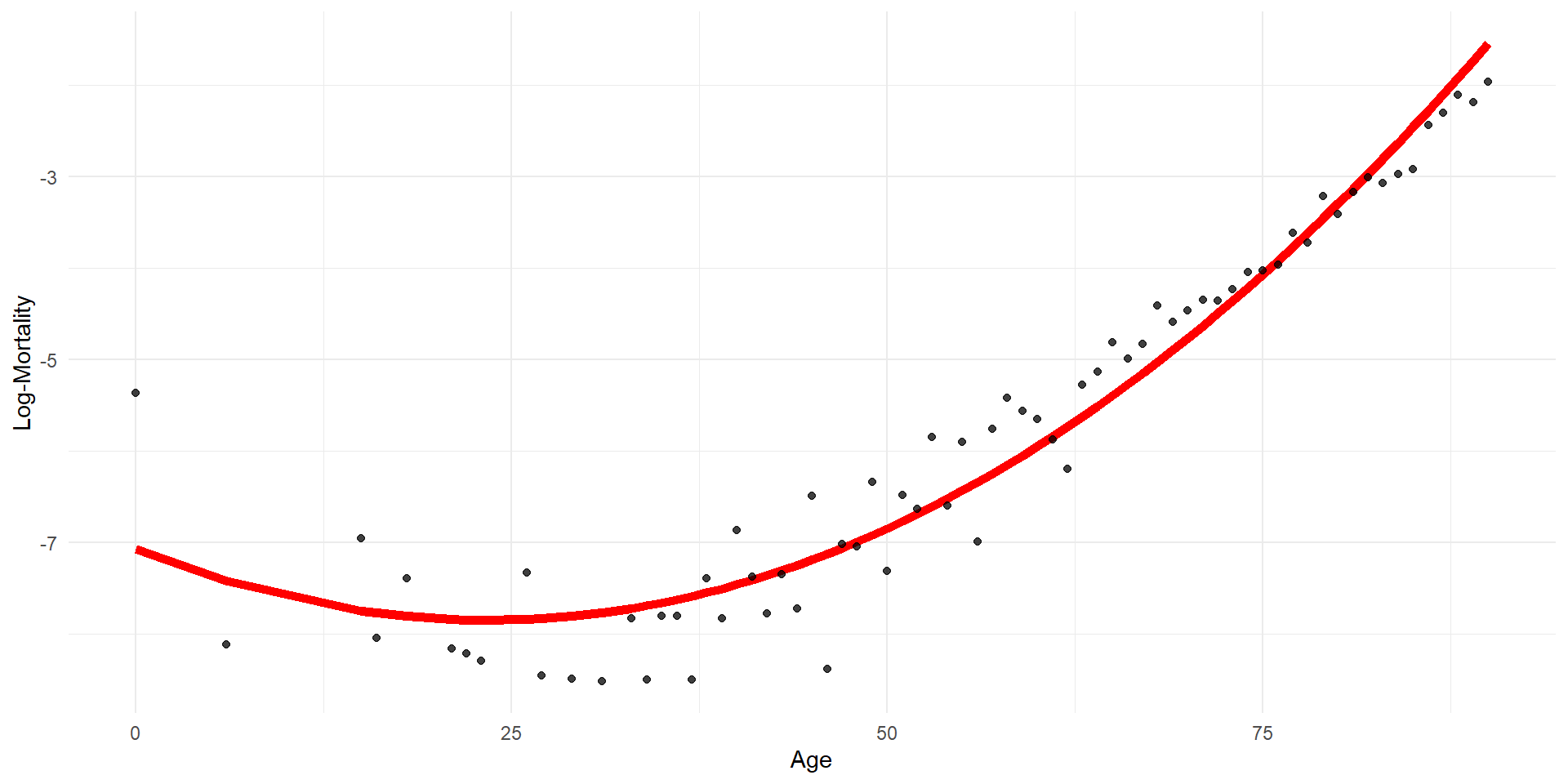
Linear regression
Code
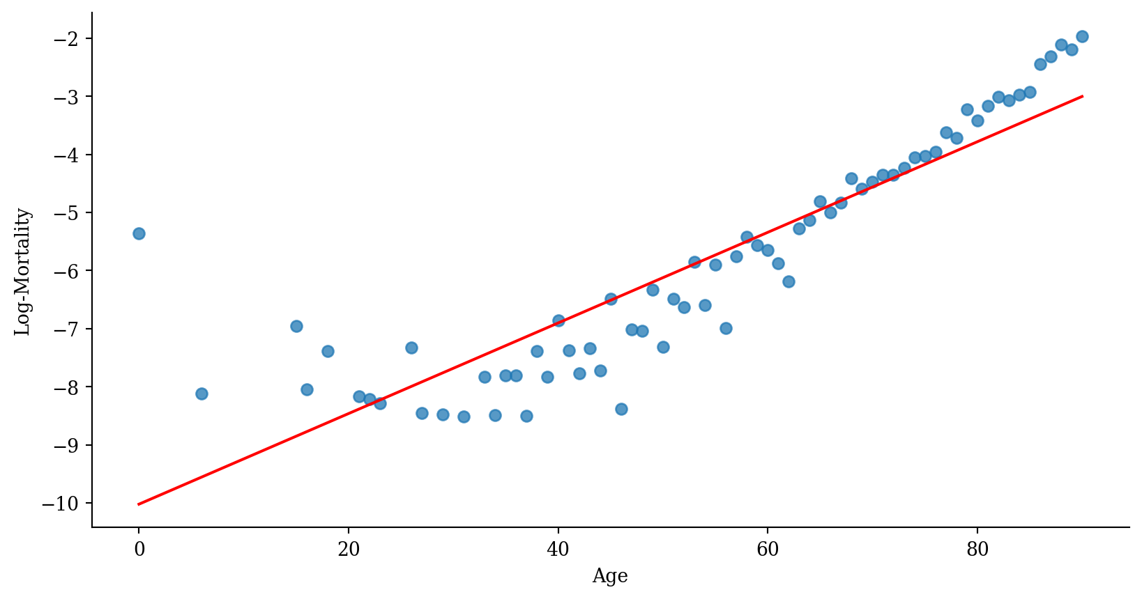
p <- ggplot(lux_2020, aes(x = age, y = log_mx)) + theme_minimal() +
  geom_point(alpha = 0.75) + labs(x = "Age", y = "Log-Mortality")

age_grid <- data.frame(age = seq(min(lux$age), max(lux$age), by=0.1))
predictions <- predict(model_lr, newdata = age_grid)

p + geom_line(data = age_grid, aes(x = age, y = predictions),
              color = "red", linewidth=2)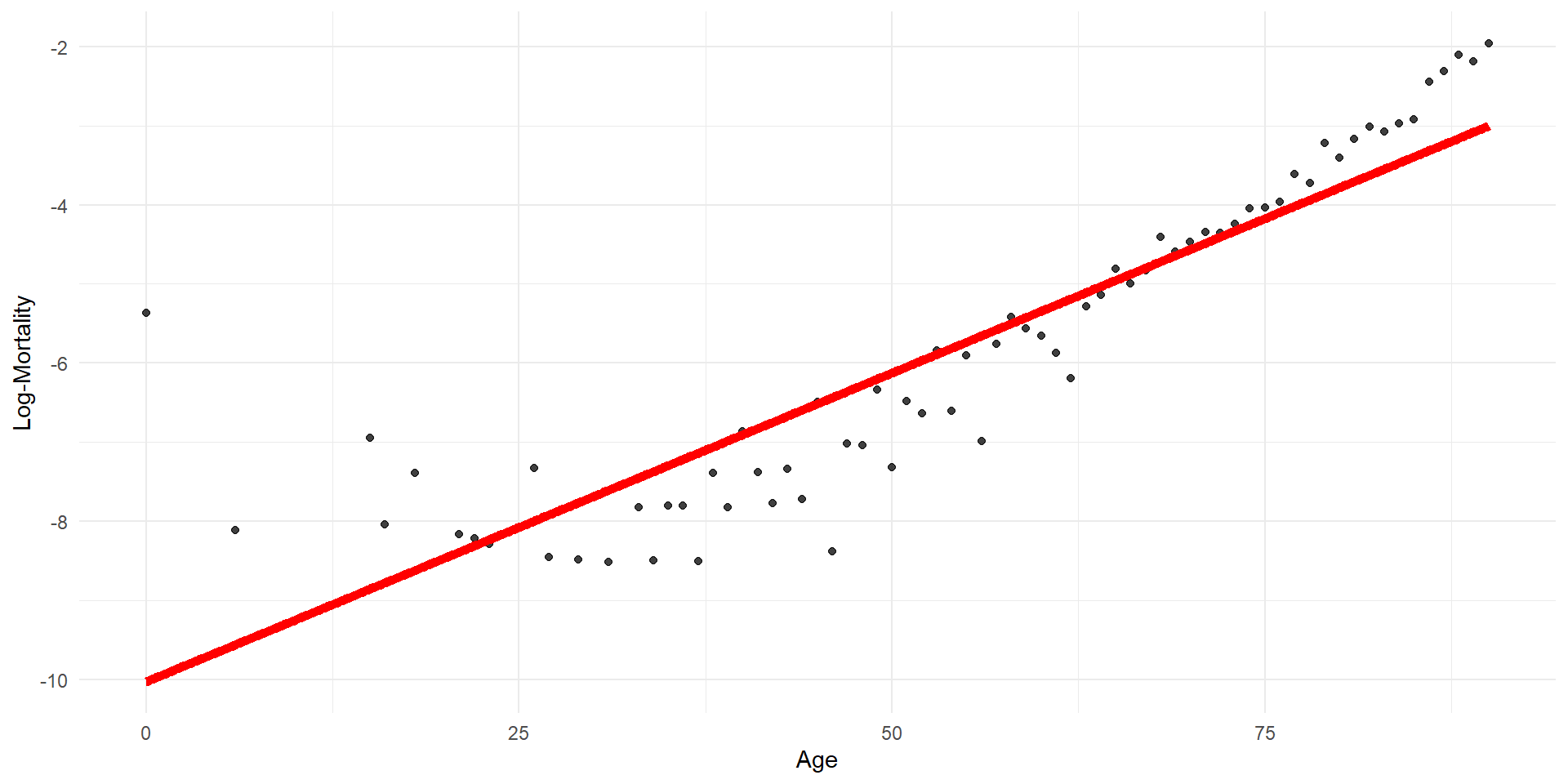
Quadratic regression
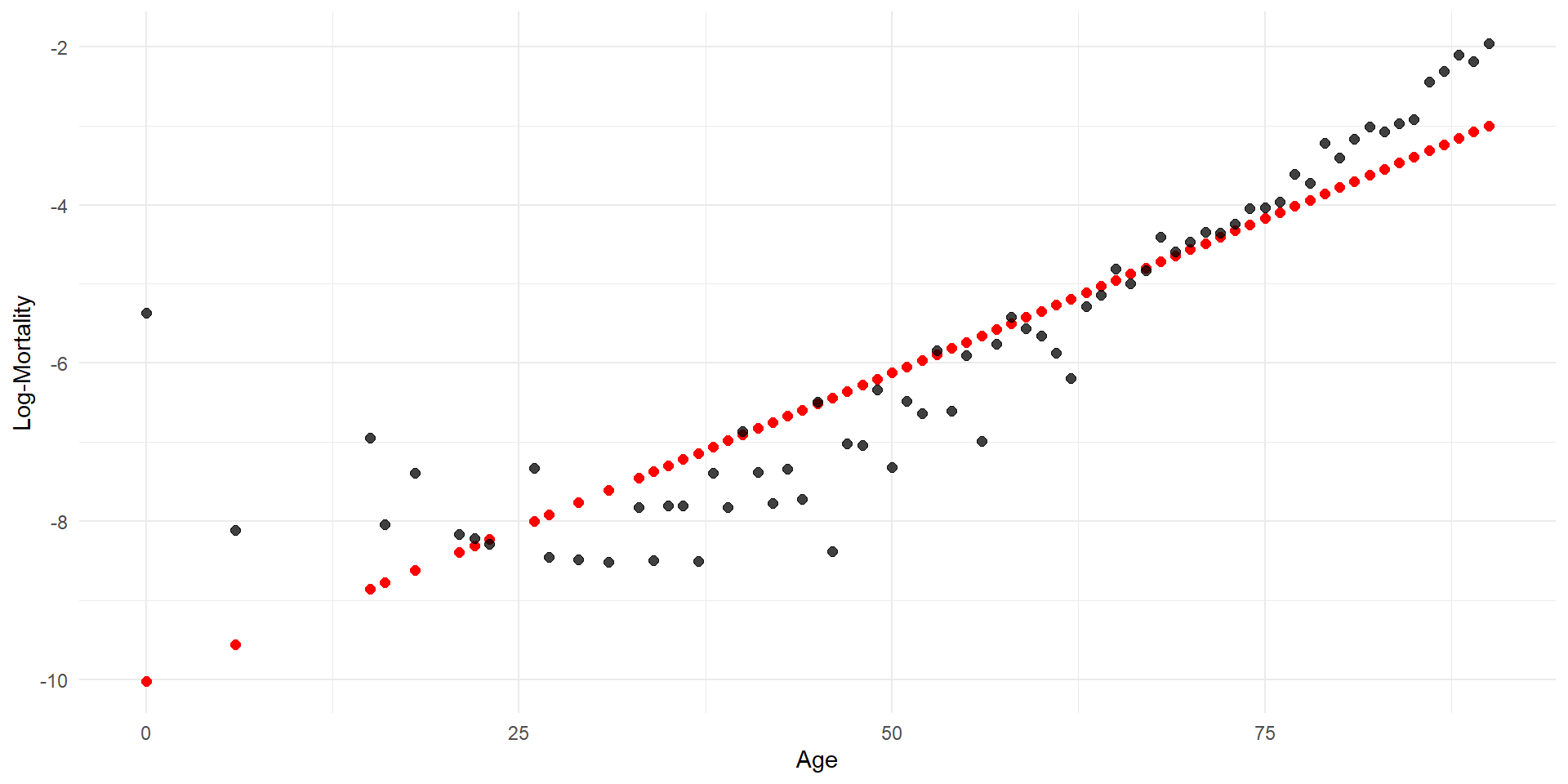
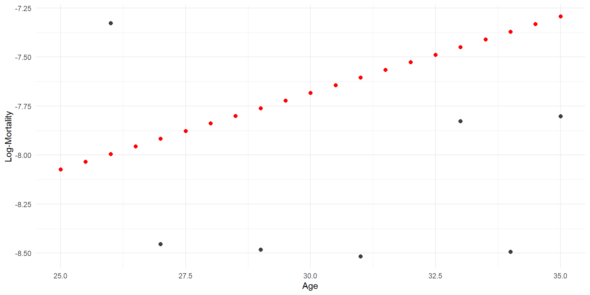
Step function regression
Code
p <- ggplot(lux_2020, aes(x = age, y = log_mx)) + theme_minimal() +
  geom_point(alpha = 0.75) + labs(x = "Age", y = "Log-Mortality")

age_grid <- data.frame(age = seq(min(lux$age), max(lux$age), by=0.1))
predictions <- predict(model_step, newdata = age_grid)

p + geom_point(data = age_grid, aes(x = age, y = predictions),
              color = "red", size=2)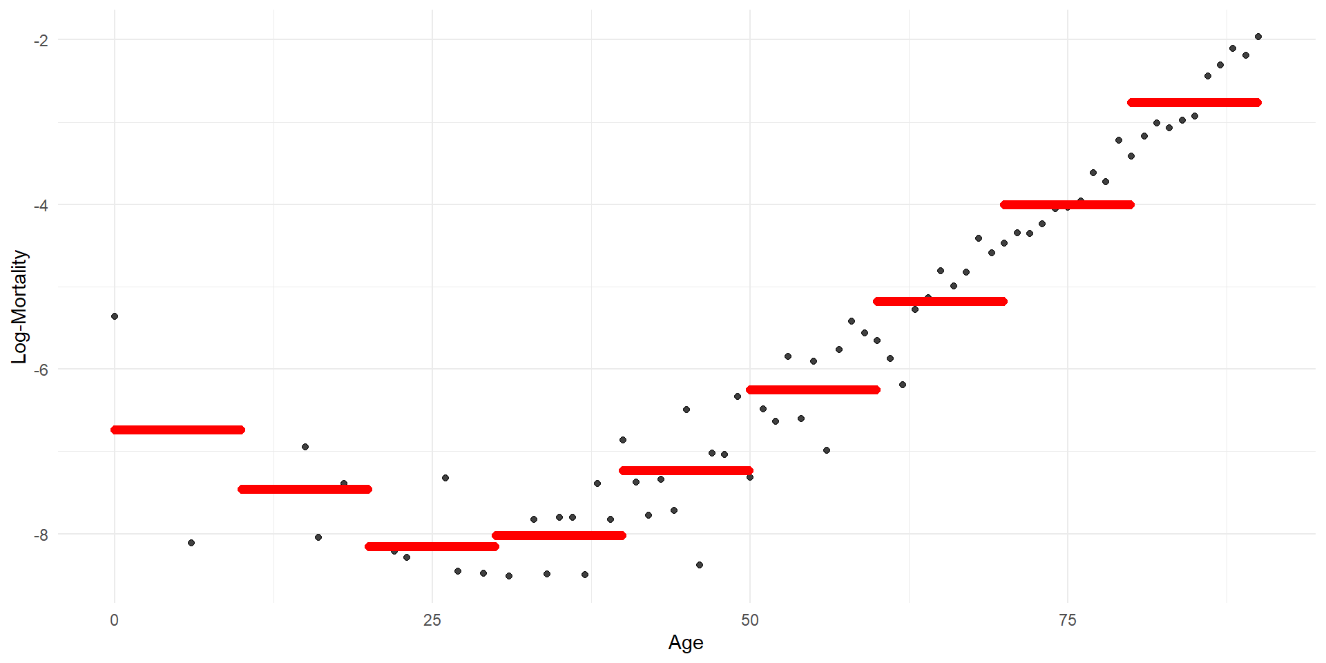
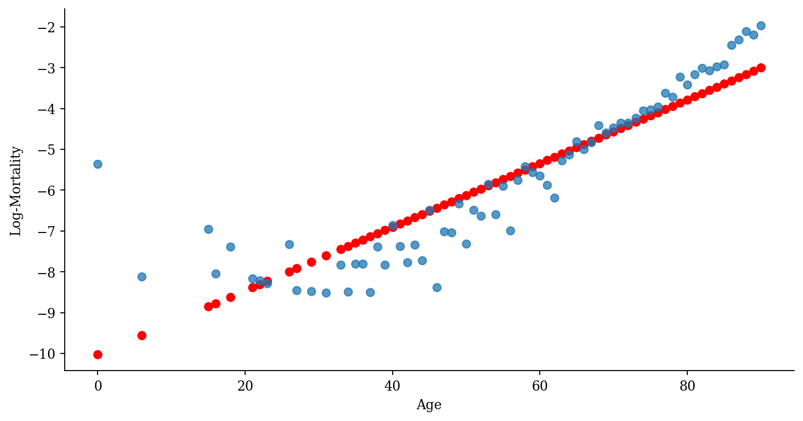
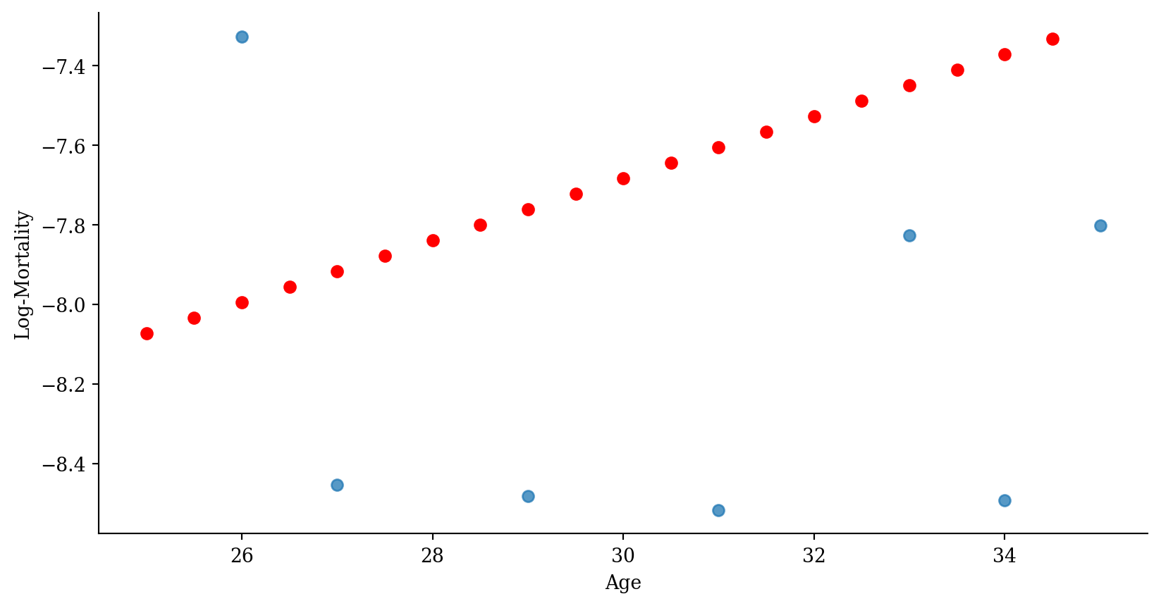
Code
# Generate a DataFrame for predictions
# This involves creating a DataFrame where 'age' spans the unique bins used in the model
age_grid = np.linspace(0, 101, 1000)

df_plot = pd.DataFrame({
  'age': age_grid,
  'age_bin_str': pd.cut(age_grid, bins=np.arange(0, 101, 10), right=False).astype(str)}
)

# Predict using the model
df_plot['predictions'] = model_step.predict(df_plot)

# Plot
plt.scatter(lux_2020['age'], lux_2020['log_mx'], alpha=0.75)
plt.scatter(df_plot['age'], df_plot['predictions'], color='red', linewidth=2)
plt.xlabel('Age')
plt.ylabel('Log-Mortality')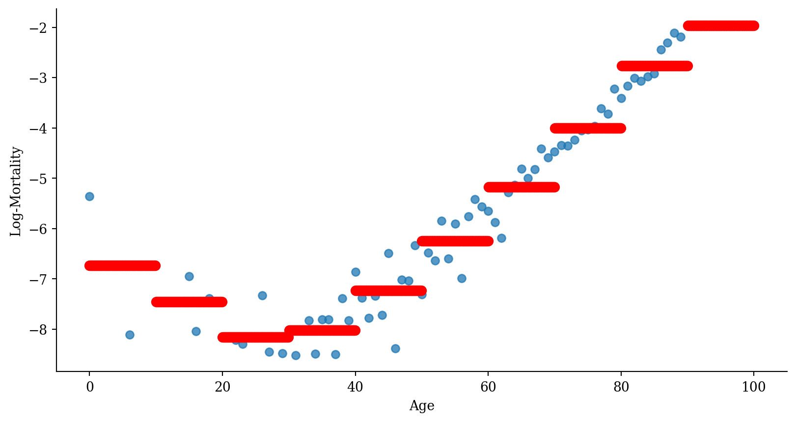
Regression spline
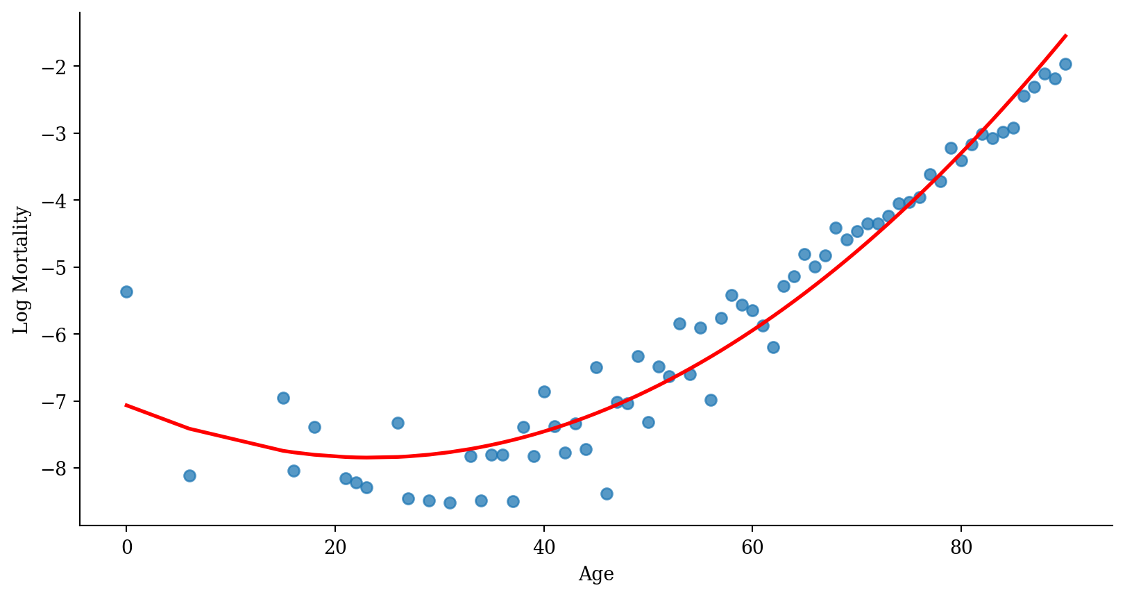
Code
# Prepare data for plotting
x_range = pd.DataFrame({'age': np.linspace(lux_2020['age'].min(), lux_2020['age'].max(), 100)})
x_range_transformed = dmatrix("bs(x_range, degree=3, knots=[15,30,45])", {"x_range": x_range['age']}, return_type='dataframe')

predictions_spline = model_spline.predict(x_range_transformed)

plt.scatter(lux_2020['age'], lux_2020['log_mx'], alpha=0.75)
plt.plot(x_range['age'], predictions_spline, color='red')
plt.xlabel('Age'); plt.ylabel('Log Mortality');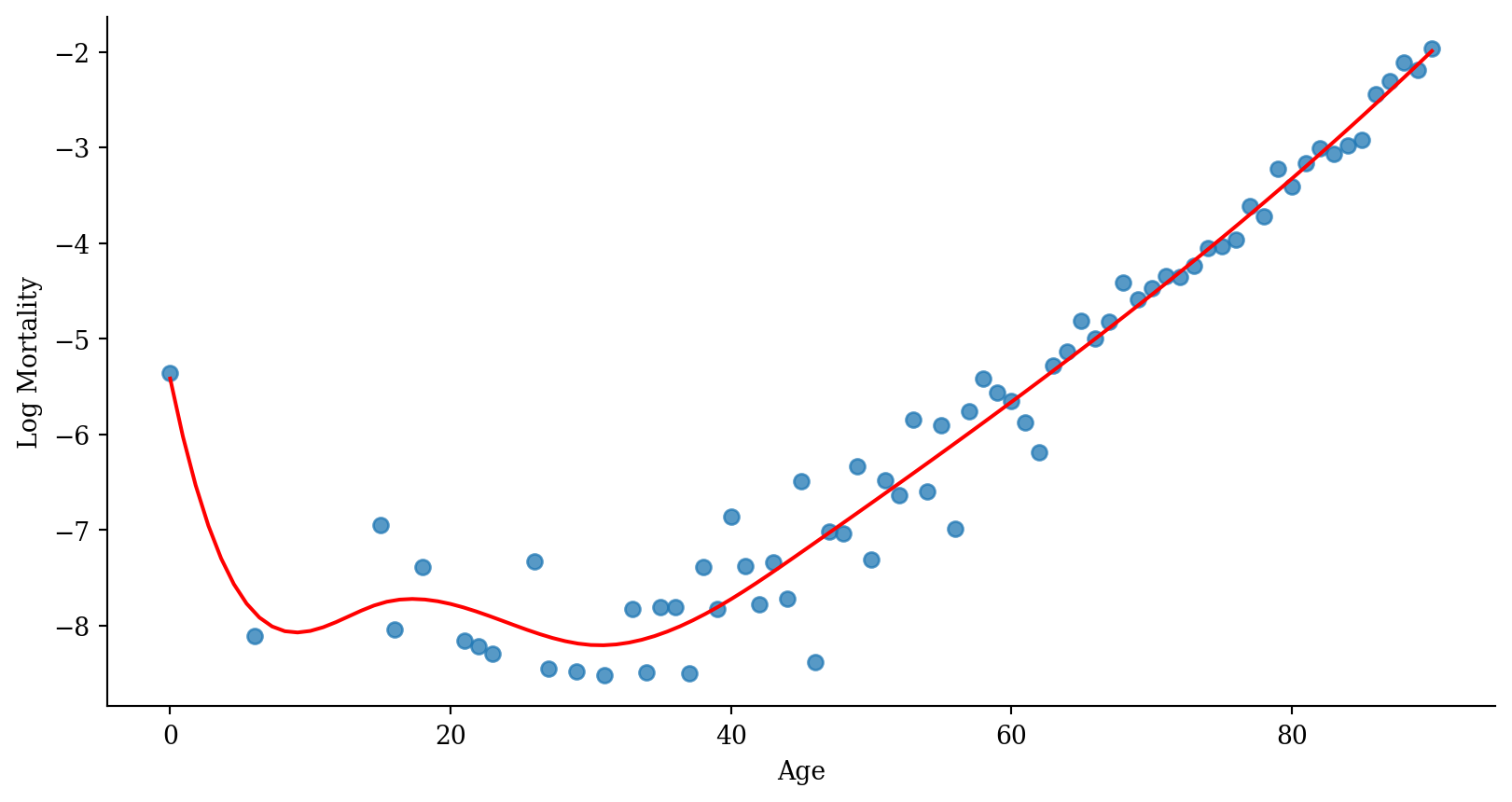
Industry approaches
Methods from this class (p. 8–9):
- ridge regression
- lasso regression
- elastic net
- generalised linear models
- generalised additive models
- random forests
- dimension reduction
- (artificial neural networks)
Take ACTL3141/ACTL5104 for mortality modelling, ACTL3143/ACTL5111 for actuarial AI
Linear Regression
Lecture Outline
Linearity & Nonlinearity
Data Science Starts With Data
Linear Regression
Polynomial Regression
Step Functions
Regression Splines
Smoothing Splines
Local Regression
Generalised Additive Models (GAMs)
Plotting the fitted values
Linear regression with error bars
Interpolating
Extrapolating
Multiple linear regression
# A tibble: 6 × 3
    age  year log_mx
  <int> <int>  <dbl>
1     0  1960  -3.74
2     1  1960  -6.38
3     2  1960  -6.37
4     3  1960  -6.68
5     4  1960  -7.08
6 5 1960 -7.04Fitting:
Predicting:
Fitted multiple linear regression
Code
# This code chunk is courtesy of ChatGPT.
library(plotly)
model <- lm(log_mx ~ age + year, data = lux)
# Predict values over a grid to create the regression plane
# Create a sequence of ages and years that covers the range of your data
age_range <- seq(min(lux$age), max(lux$age), length.out = 100)
year_range <- seq(min(lux$year), max(lux$year), length.out = 100)

# Create a grid of age and year values
grid <- expand.grid(age = age_range, year = year_range)

# Predict log_mx for the grid
grid$log_mx <- predict(model, newdata = grid)

# Plot
fig <- plot_ly(lux, x = ~age, y = ~year, z = ~log_mx, type = 'scatter3d', mode = 'markers', size = 0.5) %>%
  add_trace(data = grid, x = ~age, y = ~year, z = ~log_mx, type = 'mesh3d', opacity = 0.5) %>%
  layout(scene = list(xaxis = list(title = 'Age'),
                      yaxis = list(title = 'Year'),
                      zaxis = list(title = 'Log-Mortality')))

# Show the plot
fig
Link to interactive notebook
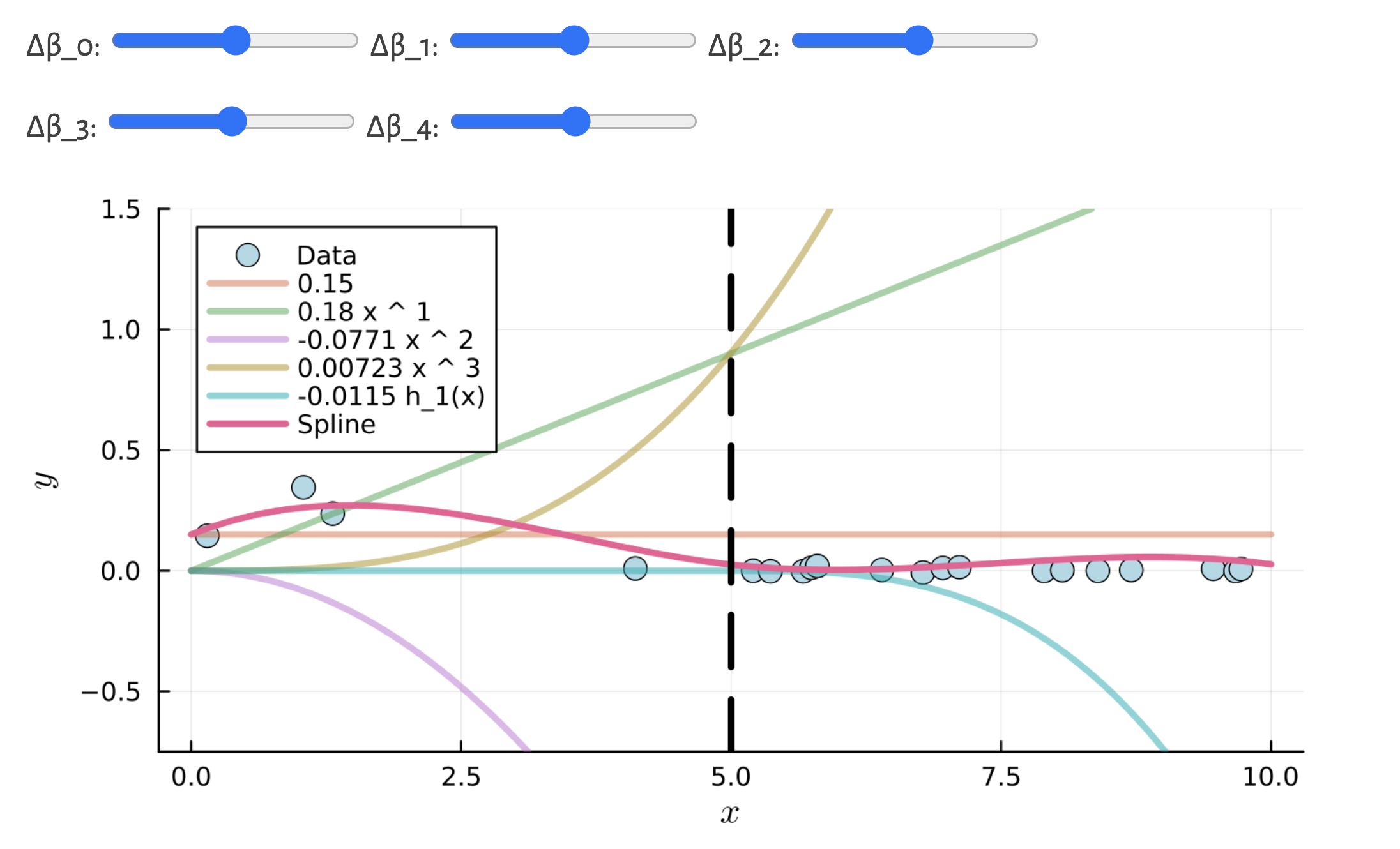
See the spline demo notebook for a high-level view of these methods
Polynomial Regression
Lecture Outline
Linearity & Nonlinearity
Data Science Starts With Data
Linear Regression
Polynomial Regression
Step Functions
Regression Splines
Smoothing Splines
Local Regression
Generalised Additive Models (GAMs)
Polynomial regression
Extend the standard linear model
y_i = \beta_0 + \beta_1 x_i + \varepsilon_i
to
y_i = \beta_0 + \beta_1 x_i + \beta_2 x_i^2 + \cdots + \beta_d x_i^d + \varepsilon_i
- Relaxes the assumption that predictor and response are linearly related.
- Works almost identically to multiple linear regression, except the other “predictors” are just transformations of the initial predictor.
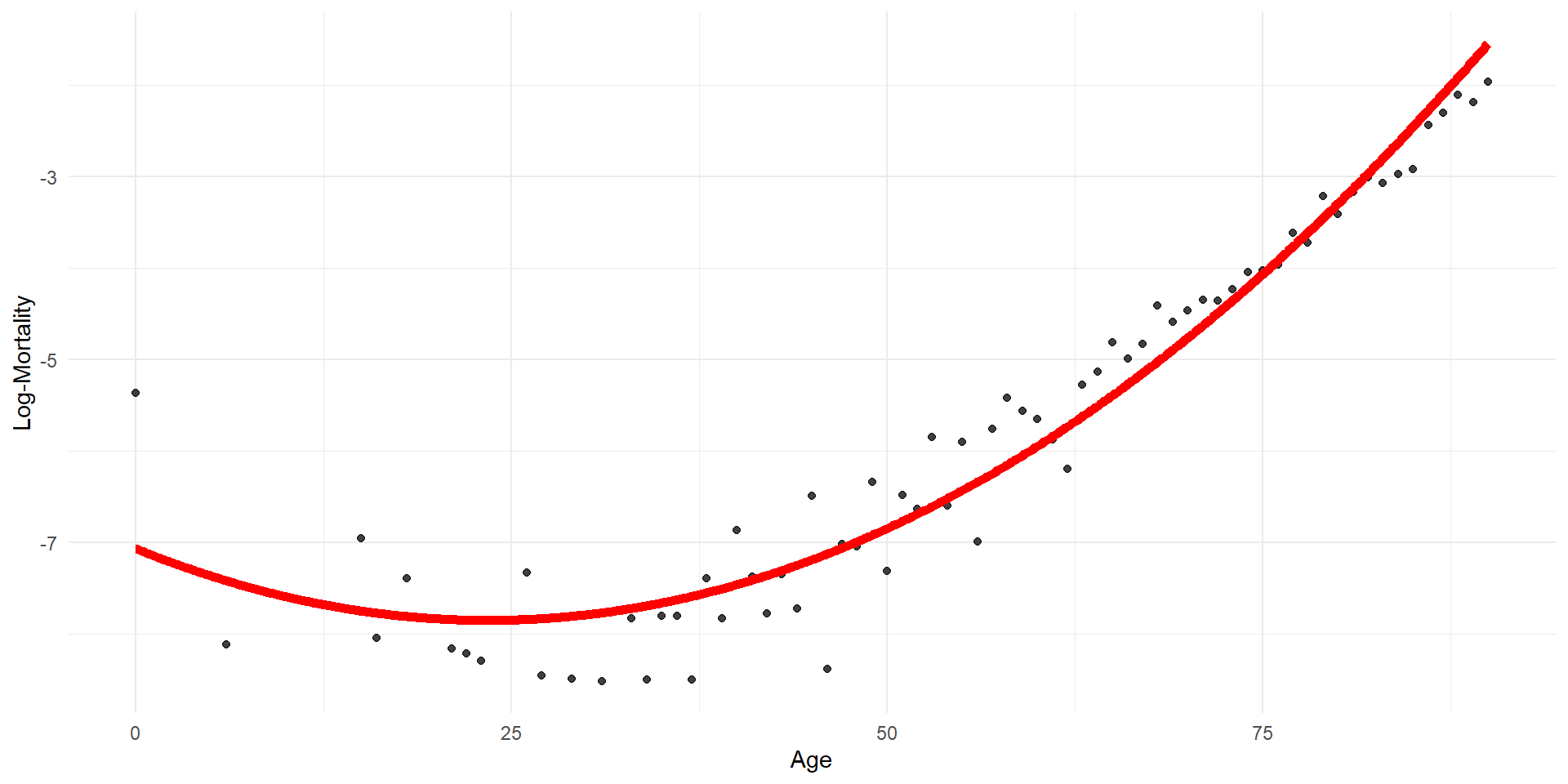
Quadratic regression (by hand)
  age age2    log_mx
1   0    0 -5.363176
2   6   36 -8.111728
3  15  225 -6.949619
4  16  256 -8.040959
5  18  324 -7.389022
6 21 441 -8.159519 (Intercept) age age2
-7.065977594 -0.066603952 0.001421058 This is a linear model of a nonlinearly transformed variable.
The poly function
  age    log_mx
1   0 -5.363176
2   6 -8.111728
3  15 -6.949619
4  16 -8.040959
5  18 -7.389022
6 21 -8.159519 (Intercept) poly(age, 2)1 poly(age, 2)2
-5.787494 14.534731 6.376355 Now we can’t put in age^2 as a separate variable.
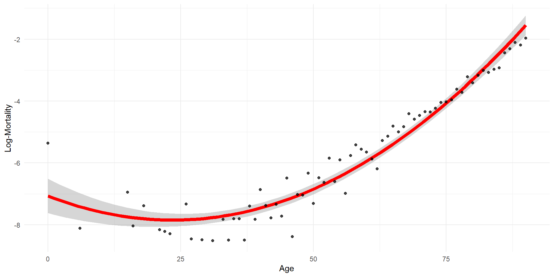
Quadratic regression with error bars
Polynomial expansion
  (Intercept) poly(age, 2, raw = TRUE)1 poly(age, 2, raw = TRUE)2
1           1                         0                         0
2           1                         1                         1
3           1                         2                         4
4           1                         3                         9
5 1 4 16[1] 0.9676666Monomials plotted (raw=TRUE)
Code
df_poly <- data.frame(age = lux$age, age_poly[, -1])

df_poly_long <- df_poly %>%
  pivot_longer(cols = -age, names_to = "Polynomial", values_to = "Value")

ggplot(df_poly_long, aes(x = age, y = Value, color = Polynomial)) +
  geom_line(linewidth=2) +
  theme_minimal() +
  labs(title = "Polynomial Terms of Age",
       x = "Age",
       y = "Polynomial Value",
       color = "Term")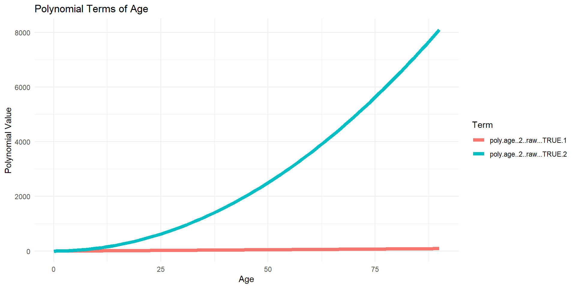
Orthogonal polynomials plotted (default)
Code
df_poly <- data.frame(age = lux$age, age_poly[, -1])

df_poly_long <- df_poly %>%
  pivot_longer(cols = -age, names_to = "Polynomial", values_to = "Value")

ggplot(df_poly_long, aes(x = age, y = Value, color = Polynomial)) +
  geom_line(linewidth=2) +
  theme_minimal() +
  labs(title = "Polynomial Terms of Age",
       x = "Age",
       y = "Polynomial Value",
       color = "Term")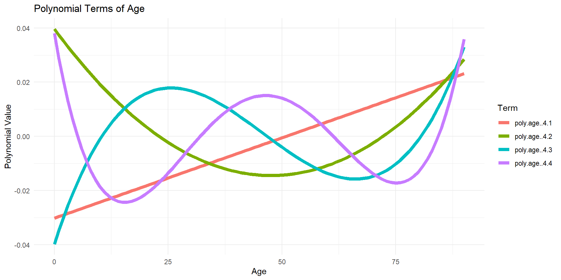
Why? Raw polynomials can be highly correlated!
Reciprocal of the condition number is rcond. If this number is (very) close to 0, the computer will have a hard time finding the inverse of the matrix.
Summaries of the two models
Can you spot an important difference?
Call:
lm(formula = log_mx ~ age + age2, data = df_pr)

Residuals:
     Min       1Q   Median       3Q      Max
-1.25899 -0.33912 -0.03671  0.30503  1.70280

Coefficients:
              Estimate Std. Error t value Pr(>|t|)
(Intercept) -7.0659776  0.2787615 -25.348  < 2e-16 ***
age         -0.0666040  0.0115898  -5.747 2.43e-07 ***
age2         0.0014211  0.0001108  12.820  < 2e-16 ***
---
Signif. codes:  0 '***' 0.001 '**' 0.01 '*' 0.05 '.' 0.1 ' ' 1

Residual standard error: 0.4974 on 67 degrees of freedom
Multiple R-squared:  0.9383,    Adjusted R-squared:  0.9364
F-statistic: 509.2 on 2 and 67 DF,  p-value: < 2.2e-16
Call:
lm(formula = log_mx ~ poly(age, 2), data = df_pr)

Residuals:
     Min       1Q   Median       3Q      Max
-1.25899 -0.33912 -0.03671  0.30503  1.70280

Coefficients:
              Estimate Std. Error t value Pr(>|t|)
(Intercept)   -5.78749    0.05945  -97.36   <2e-16 ***
poly(age, 2)1 14.53473    0.49736   29.22   <2e-16 ***
poly(age, 2)2  6.37636    0.49736   12.82   <2e-16 ***
---
Signif. codes:  0 '***' 0.001 '**' 0.01 '*' 0.05 '.' 0.1 ' ' 1

Residual standard error: 0.4974 on 67 degrees of freedom
Multiple R-squared:  0.9383,    Adjusted R-squared:  0.9364
F-statistic: 509.2 on 2 and 67 DF,  p-value: < 2.2e-16
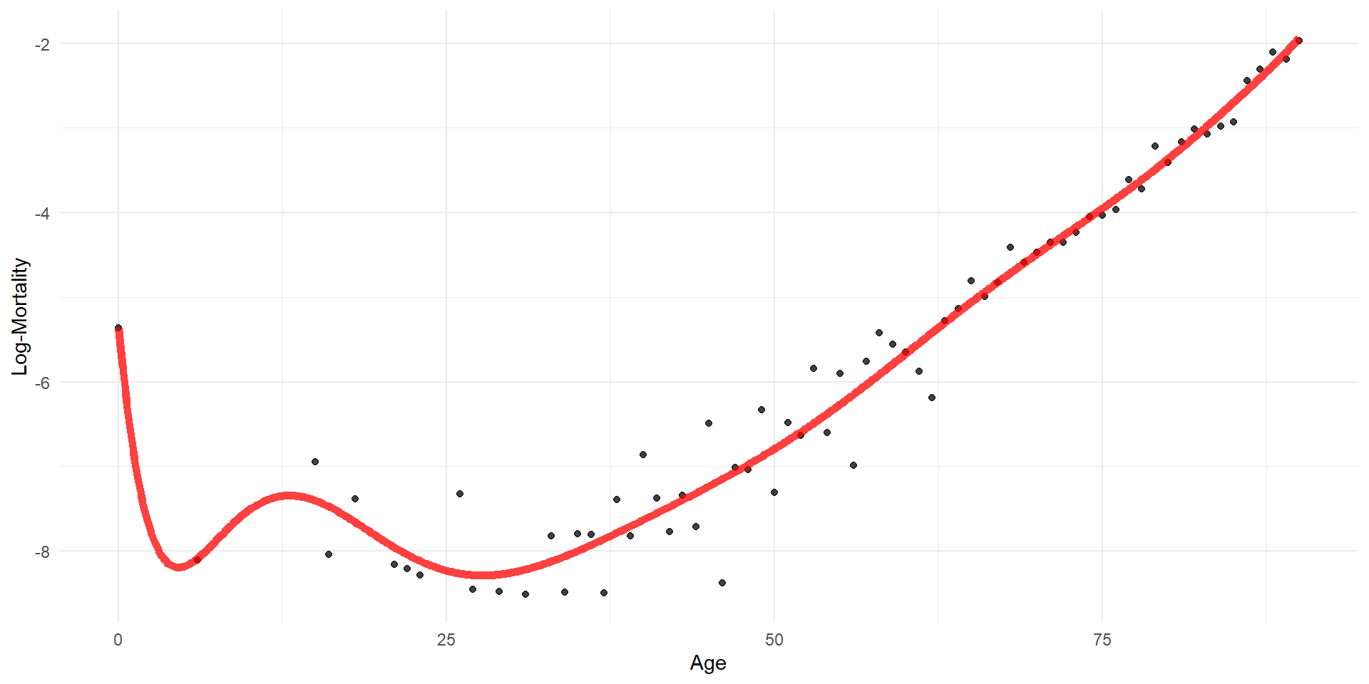
Polynomial regression: increasing the order
Code
orders <- 1:20
for (i in seq_along(orders)) {
  order <- orders[i]

  formula <- as.formula(glue("log_mx ~ poly(age, {order})"))
  model <- lm(formula, data = lux_2020)

  age_grid$log_mx <- predict(model, newdata = age_grid)

  plot_regression(lux_2020, age_grid, "age", "log_mx",
                  glue("Polynomial Regression Order {order}"),
                  glue("./Animations/NonLinear/Poly{i}.svg"))
}
Can easily use polynomials in classification
(Right Side:) Model of binary event Wage > 250 via logistic regression
\mathbb{P}(y_i > 250|x_i) = \frac{\exp(\beta_0 + \beta_1x_i + \beta_2x_i^2 + \beta_3x_i^3 + \beta_4x_i^4)}{1+\exp(\beta_0 + \beta_1x_i + \beta_2x_i^2 + \beta_3x_i^3 + \beta_4x_i^4)}
Source: James et al. (2021), An Introduction to Statistical Learning with Applications in R, Figure 7.1.
Polynomial regression: notes and problems
Pros:
- Can model more complex relationships.
- Can also be used in logistic regression, or any linear-like regression for that matter.
Cons:
- Usually one sticks to polynomials of degree 2-4; shape can get very erratic with higher degrees.
- Can be computationally unstable with high degrees.
- Can be difficult to interpret.
Step Functions
Lecture Outline
Linearity & Nonlinearity
Data Science Starts With Data
Linear Regression
Polynomial Regression
Step Functions
Regression Splines
Smoothing Splines
Local Regression
Generalised Additive Models (GAMs)
Step functions
Polynomial regression imposes a global structure on the nonlinear function; a simple alternative is to use step functions.
Break up the range of x into k+1 distinct regions (or “bins”), using k cutpoints: c_1 < c_2 < \dots < c_k
Do a least squares fit on y_i = \beta_0 + \beta_1 I(c_1 \leq x_i < c_2) + \beta_2 I(c_2 \leq x_i < c_3) + \dots + \beta_{k-1} I(c_{k-1} \leq x_i < c_k) + \beta_k I(c_k \leq x_i)
Example: Step functions
Step function regression on Wage data
Same Wage example as before but with step functions.
Source: James et al. (2021), An Introduction to Statistical Learning with Applications in R, Figure 7.2.
Using I and cut
  (Intercept) age cut(age, breaks = c(-0.1, 5, 100), right = T)(5,100]
1           1   0                                                    0
2           1   1                                                    0
3           1   2                                                    0
4           1   3                                                    0
5           1   4                                                    0
6           1   5                                                    0
7 1 6 1Letting breaks be a single number
[1] (-0.09,22.5] (-0.09,22.5] (-0.09,22.5] (-0.09,22.5] (-0.09,22.5]
[6] (-0.09,22.5]
Levels: (-0.09,22.5] (22.5,45] (45,67.5] (67.5,90.1]
Call:
lm(formula = log_mx ~ cut(age, breaks = 4, right = T), data = lux)

Residuals:
    Min      1Q  Median      3Q     Max
-3.1872 -0.6035 -0.0220  0.5886  3.5764

Coefficients:
                                           Estimate Std. Error  t value
(Intercept)                                -7.24326    0.03111 -232.817
cut(age, breaks = 4, right = T)(22.5,45]    0.14673    0.03896    3.766
cut(age, breaks = 4, right = T)(45,67.5]    1.98093    0.03825   51.783
cut(age, breaks = 4, right = T)(67.5,90.1]  4.37103    0.03797  115.126
                                           Pr(>|t|)
(Intercept)                                 < 2e-16 ***
cut(age, breaks = 4, right = T)(22.5,45]   0.000168 ***
cut(age, breaks = 4, right = T)(45,67.5]    < 2e-16 ***
cut(age, breaks = 4, right = T)(67.5,90.1]  < 2e-16 ***
---
Signif. codes:  0 '***' 0.001 '**' 0.01 '*' 0.05 '.' 0.1 ' ' 1

Residual standard error: 0.8284 on 4786 degrees of freedom
Multiple R-squared:  0.8227,    Adjusted R-squared:  0.8226
F-statistic:  7404 on 3 and 4786 DF,  p-value: < 2.2e-16
More general viewpoint: Basis functions
Fit the model:
y_i = \beta_0 + \beta_1 b_1(x_i) + \beta_2 b_2(x_i) + \dots + \beta_k b_k(x_i)
- b_1(x_i), b_2(x_i), \dots, b_k(x_i) are “basis functions”.
- Transform the predictor before fitting, yielding multiple derived “predictors”.
\boldsymbol{X} = \begin{bmatrix} 1 & x_{11} & x_{12} & \dots & x_{1p} \\ 1 & x_{21} & x_{22} & \dots & x_{2p} \\ \vdots & \vdots & \vdots & \ddots & \vdots \\ 1 & x_{n1} & x_{n2} & \dots & x_{np} \end{bmatrix}
\boldsymbol{X} = \begin{bmatrix} 1 & b_1(x_1) & b_2(x_1) & \dots & b_k(x_1) \\ 1 & b_1(x_2) & b_2(x_2) & \dots & b_k(x_2) \\ \vdots & \vdots & \vdots & \ddots & \vdots \\ 1 & b_1(x_n) & b_2(x_n) & \dots & b_k(x_n) \end{bmatrix}
- For polynomial regression, b_j(x_i) = x_i^j
- For step function regression, b_j(x_i) = I(c_j \leq x_i < c_{j+1}) if j=1,\dots,k-1
Regression Splines
Lecture Outline
Linearity & Nonlinearity
Data Science Starts With Data
Linear Regression
Polynomial Regression
Step Functions
Regression Splines
Smoothing Splines
Local Regression
Generalised Additive Models (GAMs)
Why not both?
We can combine the previous two ideas (polynomial regression and step functions) to gain flexibility.
For example, you could fit a piecewise cubic polynomial with one “knot”: y_i = \begin{cases} \beta_{0,1} + \beta_{1,1} x_i + \beta_{2,1} x_i^2 + \beta_{3,1} x_i^3 & \text{ if } x_i < c \\ \beta_{0,2} + \beta_{1,2} x_i + \beta_{2,2} x_i^2 + \beta_{3,2} x_i^3 & \text{ if } x_i \geq c \end{cases}
We call c a “knot”: a point of our choosing where the coefficients of the model change.
Question: what are possible issues with this approach?
Unconstrained cubic regression
Unconstrained cubic regression on Wage data
Spline definition
A piecewise polynomial function of degree d is a spline if the function is continuous up to its (d-1)th derivative at each knot.
- A 1st degree spline is a piecewise linear function which is continuous. I.e., we require the 0th derivative (which is the function itself) to be continuous (so, “step functions” are not allowed).
- A 2nd degree spline is a piecewise quadratic function which is continuous and has a continuous derivative.
- A 3rd degree spline is a piecewise cubic function which is continuous and has continuous 1st and 2nd derivatives.
Example: Linear spline
Code
# Linear regression splines with different number of knots
knots_seq <- 2:11
for (i in seq_along(knots_seq)) {
  n_knots <- knots_seq[i]
  knots <- quantile(lux_2020$age, probs = seq(0, 1, length.out = n_knots + 1))[-c(1, n_knots + 2)]
  formula <- as.formula(glue("log_mx ~ bs(age, degree=1, knots = c({toString(knots)}))"))
  model <- lm(formula, data = lux_2020)

  age_grid$log_mx <- predict(model, newdata = age_grid)

  plot_regression(lux_2020, age_grid, "age", "log_mx",
                  glue("Cubic Spline with {n_knots} Knots"),
                  glue("./Animations/NonLinear/SplineCub{i}.svg"),
                  knots = knots)
}
Example: Cubic spline
Code
# Cubic regression splines with different number of knots
knots_seq <- 2:11
for (i in seq_along(knots_seq)) {
  n_knots <- knots_seq[i]
  knots <- quantile(lux_2020$age, probs = seq(0, 1, length.out = n_knots + 1))[-c(1, n_knots + 2)]
  formula <- as.formula(glue("log_mx ~ bs(age, degree=3, knots = c({toString(knots)}))"))
  model <- lm(formula, data = lux_2020)

  age_grid$log_mx <- predict(model, newdata = age_grid)

  plot_regression(lux_2020, age_grid, "age", "log_mx",
                  glue("Cubic Spline with {n_knots} Knots"),
                  glue("./Animations/NonLinear/SplineCub{i}.svg"),
                  knots = knots)
}
Examples: Different types of splines
Four varieties of splines fit on a subset of the Wage data
Source: James et al. (2021), An Introduction to Statistical Learning with Applications in R, Figure 7.3.
Cubic splines & natural splines
The cubic is preferred as it is the smallest order where the knots are not visible without close inspection.
We can extend the idea of a cubic spline to a natural cubic spline. It is a spline where outside the boundary knots (extrapolation) the function is linear.
Wage subsetWage dataSource: James et al. (2021), An Introduction to Statistical Learning with Applications in R, Figures 7.4 and 7.7.
Smoothing Splines
Lecture Outline
Linearity & Nonlinearity
Data Science Starts With Data
Linear Regression
Polynomial Regression
Step Functions
Regression Splines
Smoothing Splines
Local Regression
Generalised Additive Models (GAMs)
Smoothing splines
- Goal: fit a function g which minimises the MSE whilst still being ‘smooth’, i.e.,
\text{minimise:} \quad \frac{1}{n} \sum_{i=1}^n (y_i - g(x_i))^2 + \lambda \int g''(x)^2 \, \mathrm{d}x.
- The integral term is a penalty on the “roughness” of g, with \lambda a tuning parameter (larger \lambda means we penalise more a rough fit).
- \lambda = 0: g will be very lumpy and will just interpolate all training data points (more flexible: less bias for more variance).
- \lambda \to \infty: g will be a straight line fit (less flexible: more bias for less variance).
- The solution for g turns out to be a (shrunken) natural cubic spline, with knots at every training data point.
Note
For mortality smoothing, US uses smoothing splines, UK uses regression splines.
Example: Smoothing splines
Code
# Smoothing splines with different df (degrees of freedom)
dfs <- seq(2, 20, length.out = 10)

for (i in seq_along(dfs)) {
  df <- dfs[i]
  model <- smooth.spline(lux_2020$age, lux_2020$log_mx, df = df)
  predictions <- predict(model, age_grid$age)
  age_grid$log_mx <- predictions$y

  plot_regression(lux_2020, age_grid, "age", "log_mx",
                  glue("Smoothing Spline with df {df}"),
                  glue("./Animations/NonLinear/SmoothSpline{i}.svg"))
}
Choosing \lambda
- The smaller the \lambda, the more flexible (but rougher) the fit is.
- The “effective degrees of freedom” (denoted df_\lambda) of our model hence depend on \lambda.
- df_\lambda measures the flexibility of the smoothing spline.
- it can be a non-integer (since some coefficients are constrained, they are not completely free to vary).
- Choice of \lambda can be done via Cross validation.
- LOOCV error can be computed using only one computation for each \lambda; extremely computationally efficient.
- Note a good thing about smoothing splines (in comparison to regression splines) is that we do not have to pick the “degree” of the polynomial, nor the location of our knots.
Choosing \lambda for the Luxembourg mortality data
[1] 5.08017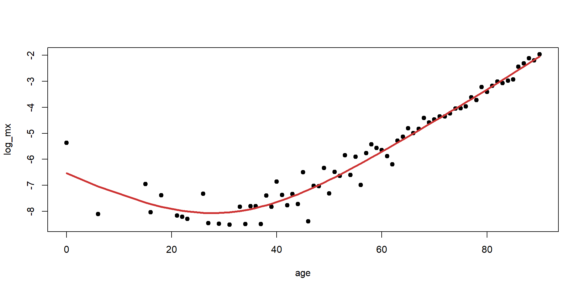
Smoothing splines on Wage data
Comparing smoothing splines
Source: James et al. (2021), An Introduction to Statistical Learning with Applications in R, Figure 7.8.
Local Regression
Lecture Outline
Linearity & Nonlinearity
Data Science Starts With Data
Linear Regression
Polynomial Regression
Step Functions
Regression Splines
Smoothing Splines
Local Regression
Generalised Additive Models (GAMs)
Local regression
Idea: predict the response y_0 associated with predictor x_0 via a linear fit, but using only the data points (x_i,y_i) that are “close” to x_0.
Algorithm:
- Gather the fraction s = k/n of training points that are the closest to x_0 (in their x_i values).
- Assign each a weight K_{i0} = K(x_i, x_0), based on how close they are to x_0 (closer points get a higher weight). Points outside those k nearest neighbours get a weight of 0.
- Fit weighted least squares regression of the y_i on the x_i, by minimising \sum_{i=1}^n K_{i0}(y_i - \beta_0 - \beta_1x_i)^2
- The fitted value is then \hat{y}_0=\hat{f}(x_0) = \hat{\beta}_0 + \hat{\beta}_1x_0.
Local regression example
Example of making predictions with local regression at x \approx 0.05 and x \approx 0.45
Source: James et al. (2021), An Introduction to Statistical Learning with Applications in R, Figure 7.9.
Local regression: comments
- Local regression does a weighted regression, using only the points around a given x_0.
- We don’t obtain a “global” equation of best fit: we need to run the procedure for each point x_0 at which we want a fitted y_0.
- Useful for updating models to recently obtained data.
- Possible to extend this idea to a few predictors (2,3, maybe 4): just have the weights based on distance in 2D, 3D or 4D space.
- Things can get problematic when p > 4, as there will be very few (if any) training observations in the neighbourhood of most points.
Local regression on Wage data
You can adjust the smoothness by changing the span
Source: James et al. (2021), An Introduction to Statistical Learning with Applications in R, Figure 7.10.
Generalised Additive Models (GAMs)
Lecture Outline
Linearity & Nonlinearity
Data Science Starts With Data
Linear Regression
Polynomial Regression
Step Functions
Regression Splines
Smoothing Splines
Local Regression
Generalised Additive Models (GAMs)
Generalised Additive Models: GAMs
- We can tranform several predictors in a non-linear way, and put them together in one model to predict y_i (as in multiple linear regression):
y_i = \beta_0 + f_1(x_{i,1}) + f_2(x_{i,2}) + ... + f_p(x_{i,p}) + \varepsilon_i
- The f_j can be virtually any function of the predictors, but all those discussed earlier (polynomials, step functions, regression and smoothing splines) are common choices.
- We can find a separate f_j for each predictor, and then just add them together in our model.
- Note we preserve the additive property of individual effects.
- Can also be used on categorical responses in a logistic regression setting.
Example: GAM on Wage data
GAM fit using regression splines
- Each plot shows the contribution of each predictor to
wage. educationis qualitative. The others are fit with natural cubic splines.
Source: James et al. (2021), An Introduction to Statistical Learning with Applications in R, Figure 7.11.
Example: GAM on Wage data
GAM fit using smoothing splines
- Each plot shows the contribution of each predictor to
wage. educationis qualitative. The others are fit with smoothing splines.
Source: James et al. (2021), An Introduction to Statistical Learning with Applications in R, Figure 7.12.
GAMs: pros and cons
- GAMs allow us to consider nonlinear relationships between the predictors and response, which can give a better fit.
- Model is additive: we can still interpret the effect of individual predictors on the response.
- However, model additivity potentially ignores interaction effects between predictors. That said, one could always add two-dimensional functions f_{j,k}(x_j, x_k) in the model, which depend on two preditors in a “non-additive” way.
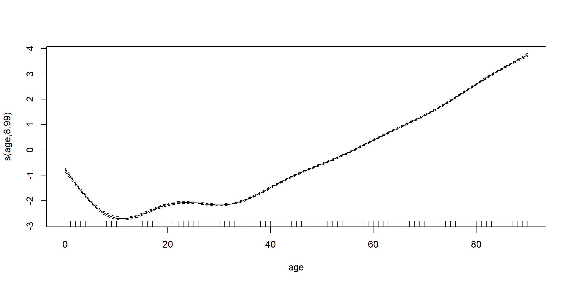
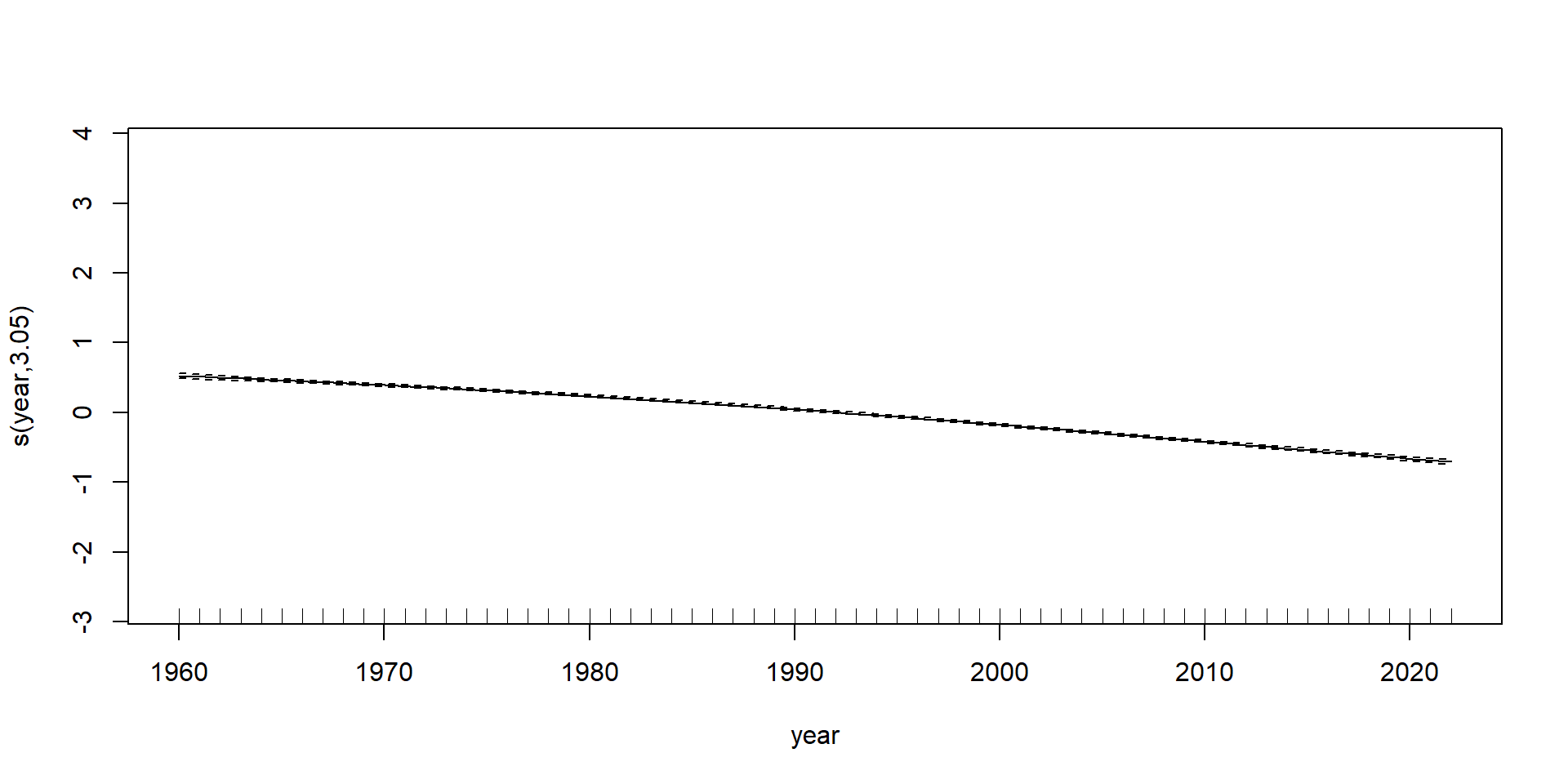
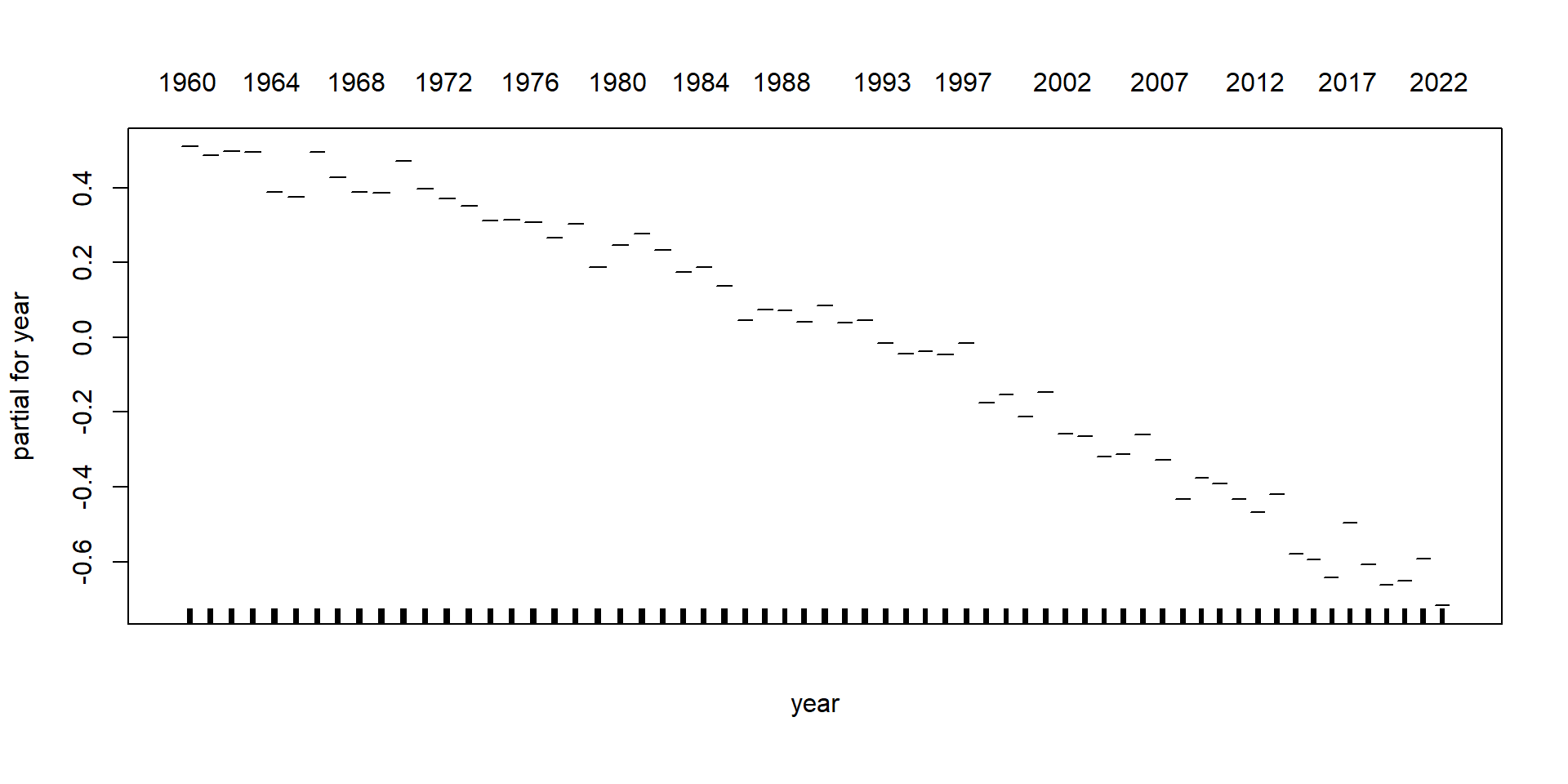
GAMs on Luxembourg data (using mgcv package)
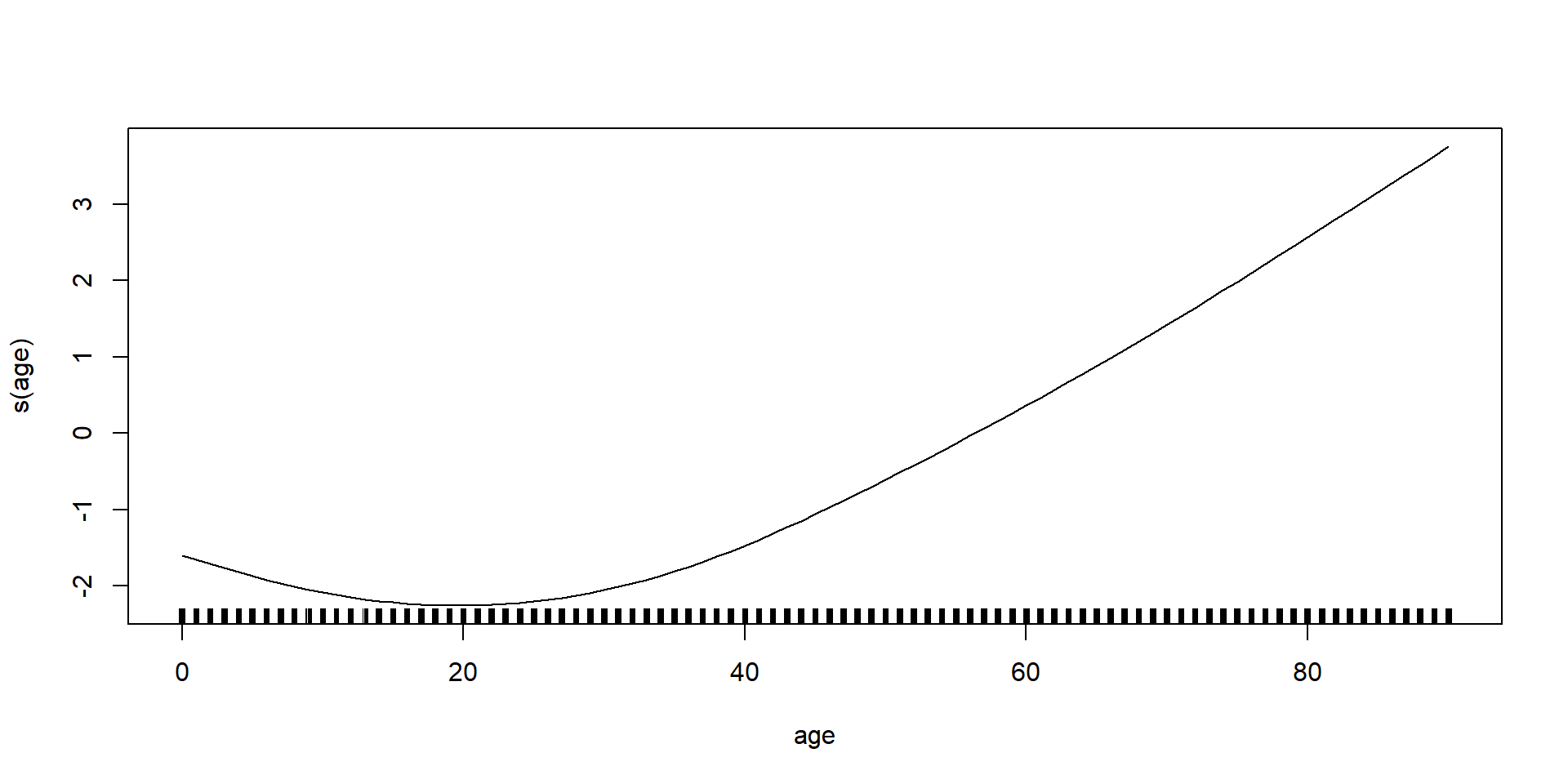
GAMs on Luxembourg data (using gam package)
Glossary
- interpolation & extrapolation
- polynomial regression
- monomials
- orthogonal polynomials
- step functions
- basis function expansion
- piecewise polynomial functions
- regression splines
- knots
- natural splines
- cubic splines
- smoothing splines
- local regression
- generalised additive models (GAMs)
Recommended viewing (splines)

It won’t help with your assessment, it’s just very entertaining/interesting.
Recommended viewing (LOESS)

R Package versions
R version 4.4.2 (2024-10-31 ucrt)
Platform: x86_64-w64-mingw32/x64
Running under: Windows 11 x64 (build 26100)

Matrix products: default


attached base packages:
[1] splines   stats     graphics  grDevices utils     datasets  methods
[8] base

other attached packages:
 [1] gam_1.22-5      foreach_1.5.2   glue_1.8.0      plotly_4.10.4
 [5] mgcv_1.9-1      nlme_3.1-166    lubridate_1.9.4 forcats_1.0.0
 [9] stringr_1.5.1   dplyr_1.1.4     purrr_1.0.2     readr_2.1.5
[13] tidyr_1.3.1     tibble_3.2.1    ggplot2_3.5.1   tidyverse_2.0.0

loaded via a namespace (and not attached):
 [1] generics_0.1.3    stringi_1.8.4     lattice_0.22-6    hms_1.1.3
 [5] digest_0.6.37     magrittr_2.0.3    evaluate_1.0.1    grid_4.4.2
 [9] timechange_0.3.0  iterators_1.0.14  fastmap_1.2.0     rprojroot_2.0.4
[13] jsonlite_1.8.9    Matrix_1.7-1      httr_1.4.7        crosstalk_1.2.1
[17] viridisLite_0.4.2 scales_1.3.0      codetools_0.2-20  lazyeval_0.2.2
[21] cli_3.6.3         rlang_1.1.4       munsell_0.5.1     withr_3.0.2
[25] yaml_2.3.10       tools_4.4.2       tzdb_0.4.0        colorspace_2.1-1
[29] here_1.0.1        reticulate_1.40.0 vctrs_0.6.5       R6_2.5.1
[33] png_0.1-8         lifecycle_1.0.4   htmlwidgets_1.6.4 pkgconfig_2.0.3
[37] pillar_1.10.1     gtable_0.3.6      data.table_1.16.4 Rcpp_1.0.13-1
[41] xfun_0.50         tidyselect_1.2.1  rstudioapi_0.17.1 knitr_1.49
[45] farver_2.1.2      htmltools_0.5.8.1 rmarkdown_2.29    labeling_0.4.3
[49] compiler_4.4.2
Python Package versions
References

