  ggplot(datasaurus_dozen, aes(x=x, y=y, colour=dataset))+
    geom_point()+
    coord_fixed(ratio=0.6)+
    theme(legend.position = "none")+
    facet_wrap(~dataset, ncol=3)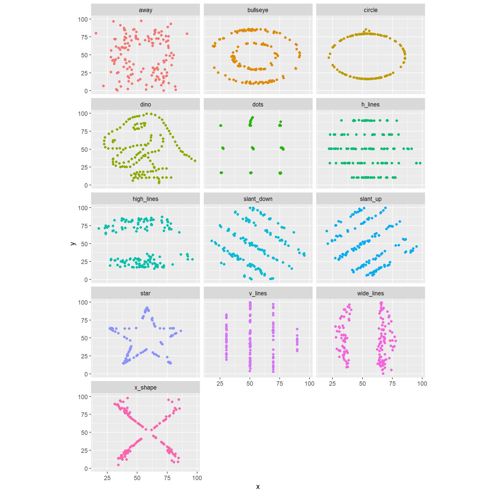
By the end of this topic, you should be able to
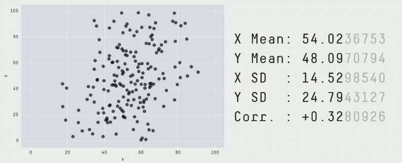
The data of the above illustration is included in the R package datasauRus.
A similar example is given by the 13 plots below. Again, the numerical summaries of those data sets are essentially the same… but look how different they are. You can even get a dinosaur!
ggplot(datasaurus_dozen, aes(x=x, y=y, colour=dataset))+
geom_point()+
coord_fixed(ratio=0.6)+
theme(legend.position = "none")+
facet_wrap(~dataset, ncol=3)
Humans spend a lot of time communicating.
If you activate different parts in the brains of your audience members, your message will be more memorable and impactful.
Data means nothing without context: you should provide a ‘story’ around it.
You can include statistics into stories, but statistics alone are rarely enough.
A good picture is worth a thousand words!
Exploratory visualisations help you understand your data
Explanatory visualisations help you explain your findings to others
Knowing exactly what you really want to say: what is the key message you want to convey?
Understand your audience
What do they want to hear (e.g., formulas? a description of the data? key outcomes?)
What is the background of the audience (e.g., a junior actuary? a senior director? your grandmother?)
Building up a story
Let’s say you are an international student at UNSW, and you want to explain to your friends back home that: Australia is a very popular destination for immigrants.
Already you have done two key steps:
Then, you need to identify what kind of data and visualisation tools you can use to make your point.
As a start, you could point out that Australia has a very positive net immigration (inflows minus outflows), at ~850,000 people for 2019-2022.
This is a good start, but a single number is a little boring (and does not provide the full story).
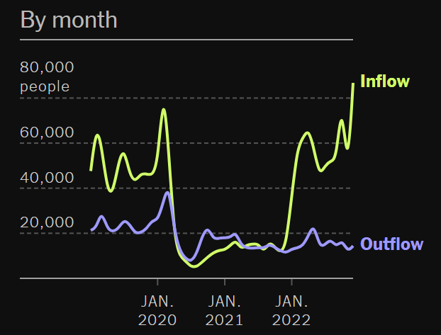
The New York Times provides cooler visualisations of migration flows: check their interactive maps here.
On the map, yellow circles represent inflows (from different countries), while purple circles represent outflows.
In the case of Australia, we see it has a positive net migration with almost all countries on Earth!
Your audience should be convinced that Australia is a very popular destination for immigrants.
Understand what you are trying to present. Is it variables themselves, relationships, trends over time, etc. ?
Then, think of the most appropriate tool to present your data
Fine tune the presentation to make your figure easy to read and ‘neat’
What scale should you use to make your figure the clearest?
Note: for explanatory visualisation, you should highlight/emphasise the key features and avoid unnecessary details.
plot() and points() are handy.longley (included in R). Similarly to functions, one can find out more about an inbuilt dataset using help(longley).plot(longley$Year, longley$Armed.Forces, type="l", lwd = 3, main="Armed Forces and Unemployment (1947-1962)", sub="Exploratory analysis",
xlab="Year", ylab="Number", ylim=c(0,600))
points(longley$Year, longley$Unemployed, type="l", lwd = 3, col="red")
legend('bottomright', legend=c("Armed Forces","Unemployed"), col=c("black","red"), lty=c(1,1))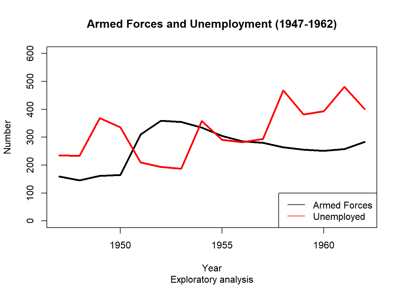
How do we create such a graph?
plot() function.plot() two arguments: a vector of x values and a vector of y values.plot(longley$Year, longley$Armed.Forces)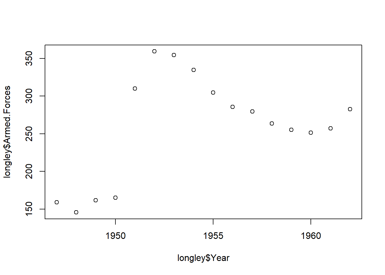
type to l. By default, this was set to p, for ‘point’. Another option is b for ‘both’ line and point.plot(longley$Year, longley$Armed.Forces, type="l")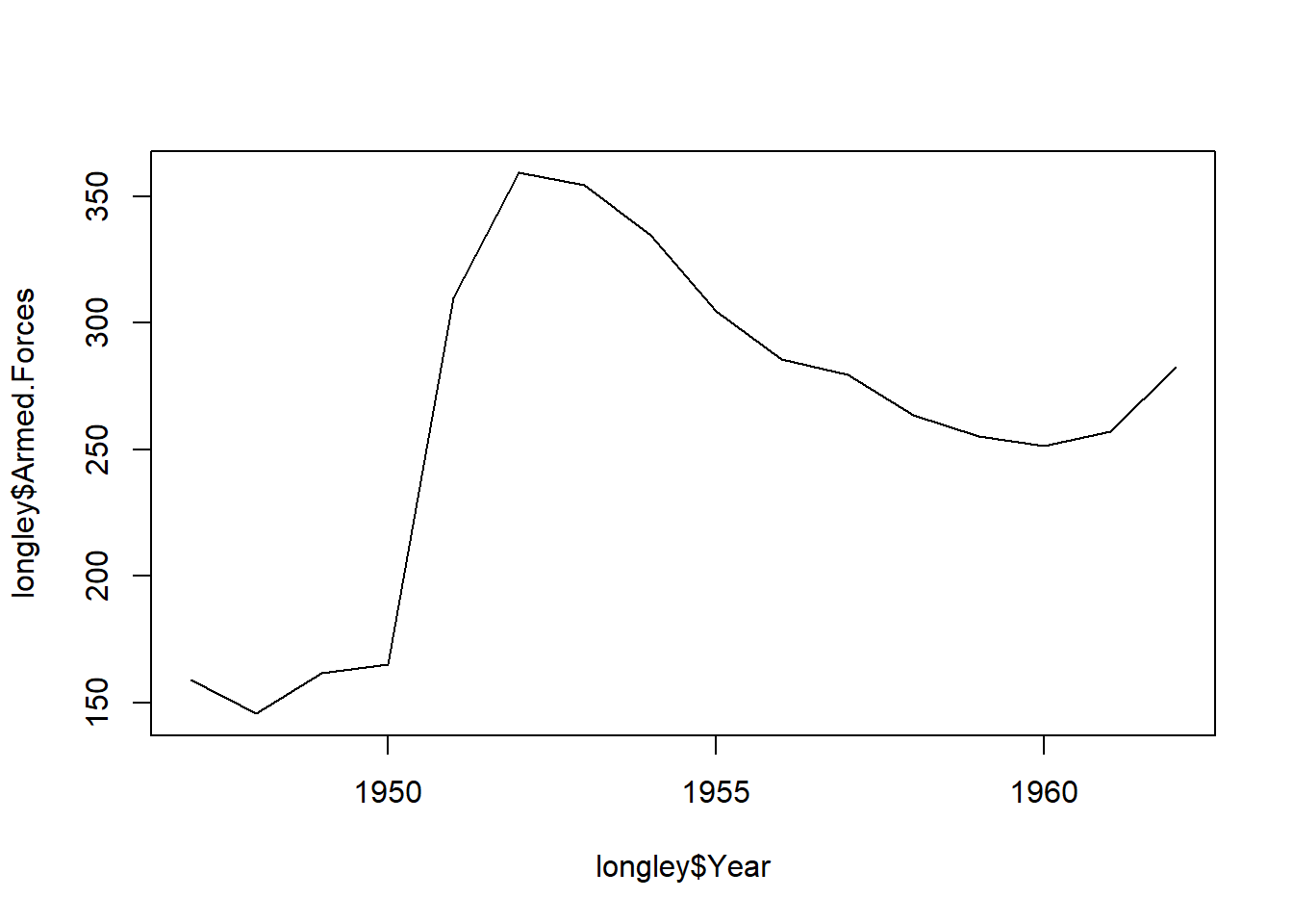
plot(longley$Year, longley$Armed.Forces, type="l",
     main="Armed Forces (1947-1962)", sub="Exploratory analysis",
     xlab="Year", ylab="Number")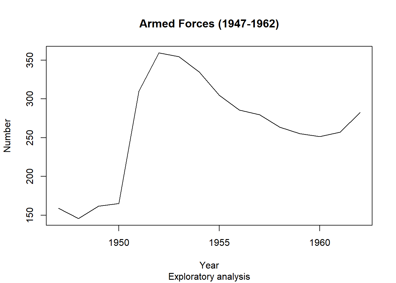
Awesome. Now let us add the second variable, Number Unemployed.
points() function has the same basic arguments as plot(), but does not create an entirely new plot.plot(longley$Year, longley$Armed.Forces, type="l",
main="Armed Forces and Unemployment (1947-1962)",
sub="Exploratory analysis",
xlab="Year", ylab="Number")
points(longley$Year, longley$Unemployed, type="l")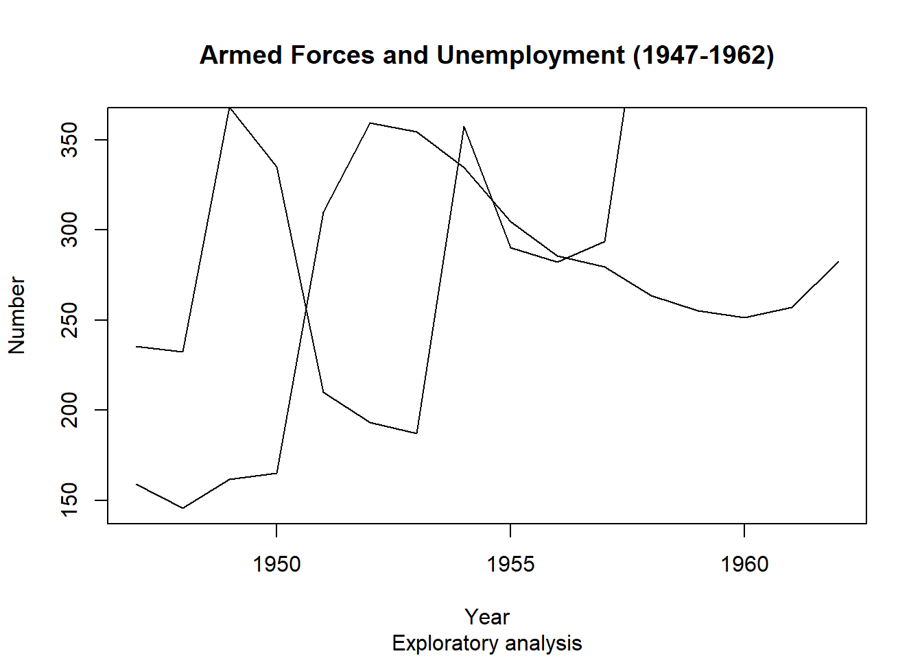
points() function does not adjust limits of the axis automatically to fit all the new data, so the new line goes off the edge of the plot.ylim= argument in plot(), to change the y limits. The input is a vector of length \(2\): c(min, max).xlim=.plot(longley$Year, longley$Armed.Forces, type="l",
main="Armed Forces and Unemployment (1947-1962)", sub="Exploratory analysis",
xlab="Year", ylab="Number", ylim=c(0,600))
points(longley$Year, longley$Unemployed, type="l")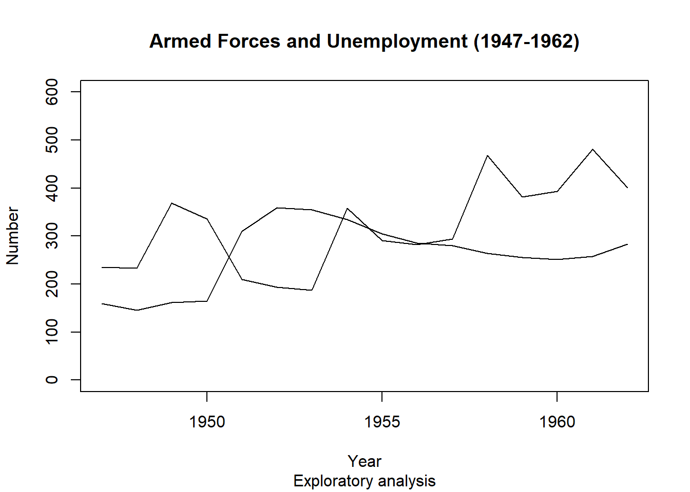
col= argument to choose a colour. Note the syntax: you need to specify the colour by a string, e.g. col = 'red'.lwd = 3, for ‘line width’.plot(longley$Year, longley$Armed.Forces, type="l", lwd = 3,
main="Armed Forces and Unemployment (1947-1962)", sub="Exploratory analysis",
xlab="Year", ylab="Number", ylim=c(0,600))
points(longley$Year, longley$Unemployed, type="l", lwd = 3, col="red")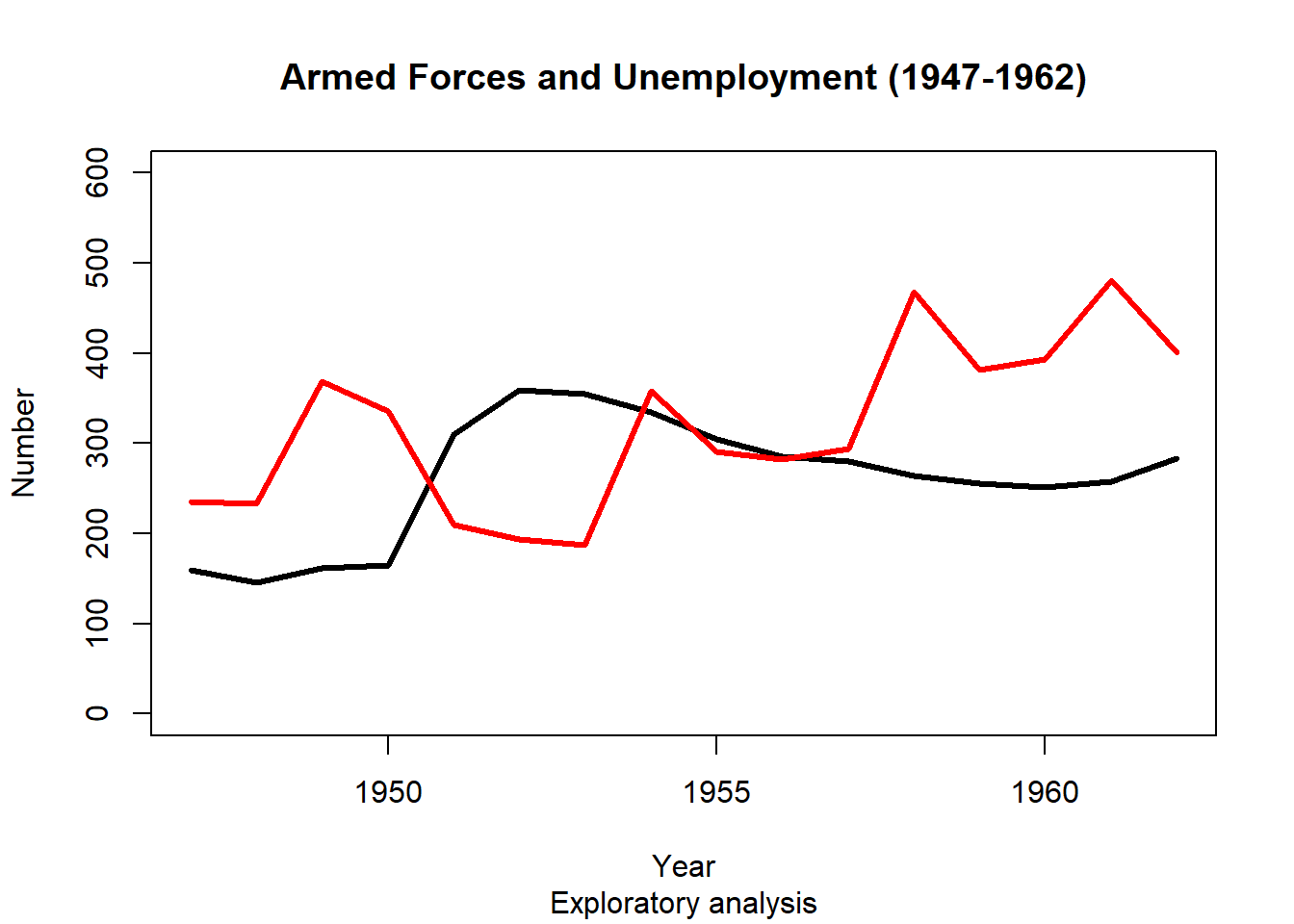
colors() function returns the names of the 657 colors known to R. You can also Google ‘R colors’ and quickly find the full palette!head(colors(), 20) [1] "white" "aliceblue" "antiquewhite" "antiquewhite1"
[5] "antiquewhite2" "antiquewhite3" "antiquewhite4" "aquamarine"
[9] "aquamarine1" "aquamarine2" "aquamarine3" "aquamarine4"
[13] "azure" "azure1" "azure2" "azure3"
[17] "azure4" "beige" "bisque" "bisque1" legend() function does this for us.plot(longley$Year, longley$Armed.Forces, type="l", lwd = 3,
main="Armed Forces and Unemployment (1947-1962)", sub="Exploratory analysis",
xlab="Year", ylab="Number", ylim=c(0,600))
points(longley$Year, longley$Unemployed, type="l", lwd = 3, col="red")
legend('bottomright', legend=c("Armed Forces","Unemployed"), col=c("black","red"), lty=c(1,1))
Any trends here?
Remember, if you ever forget how to use these functions, or how one of the arguments works, or just want to learn more about one of these function, using help() is your friend.
school_data2019.csv for illustration purposes.school_data<-read.csv("school_data2019.csv",header=TRUE)
attach(school_data)The following objects are masked from school_data (pos = 3):
Bottom.SEA.Quarter...., Boys.Enrolments, Campus.Type,
Full.Time.Equivalent.Enrolments,
Full.Time.Equivalent.Non.Teaching.Staff,
Full.Time.Equivalent.Teaching.Staff, Geolocation, Girls.Enrolments,
Governing.Body, ICSEA, ICSEA.Percentile, Indigenous.Enrolments....,
Language.Background.Other.Than.English....,
Lower.Middle.SEA.Quarter...., Net.Tax, Non.Teaching.Staff,
Postcode, Rolled.Reporting.Description, Salary.or.Wages,
School.Name, School.Sector, School.Type, State, Suburb,
Taxable.Income, Teaching.Staff, Top.SEA.Quarter....,
Total.Enrolments, Upper.Middle.SEA.Quarter....proba=T to have it on a probability scale.break for larger or smaller intervals.hist(ICSEA, xlab = "ICSEA")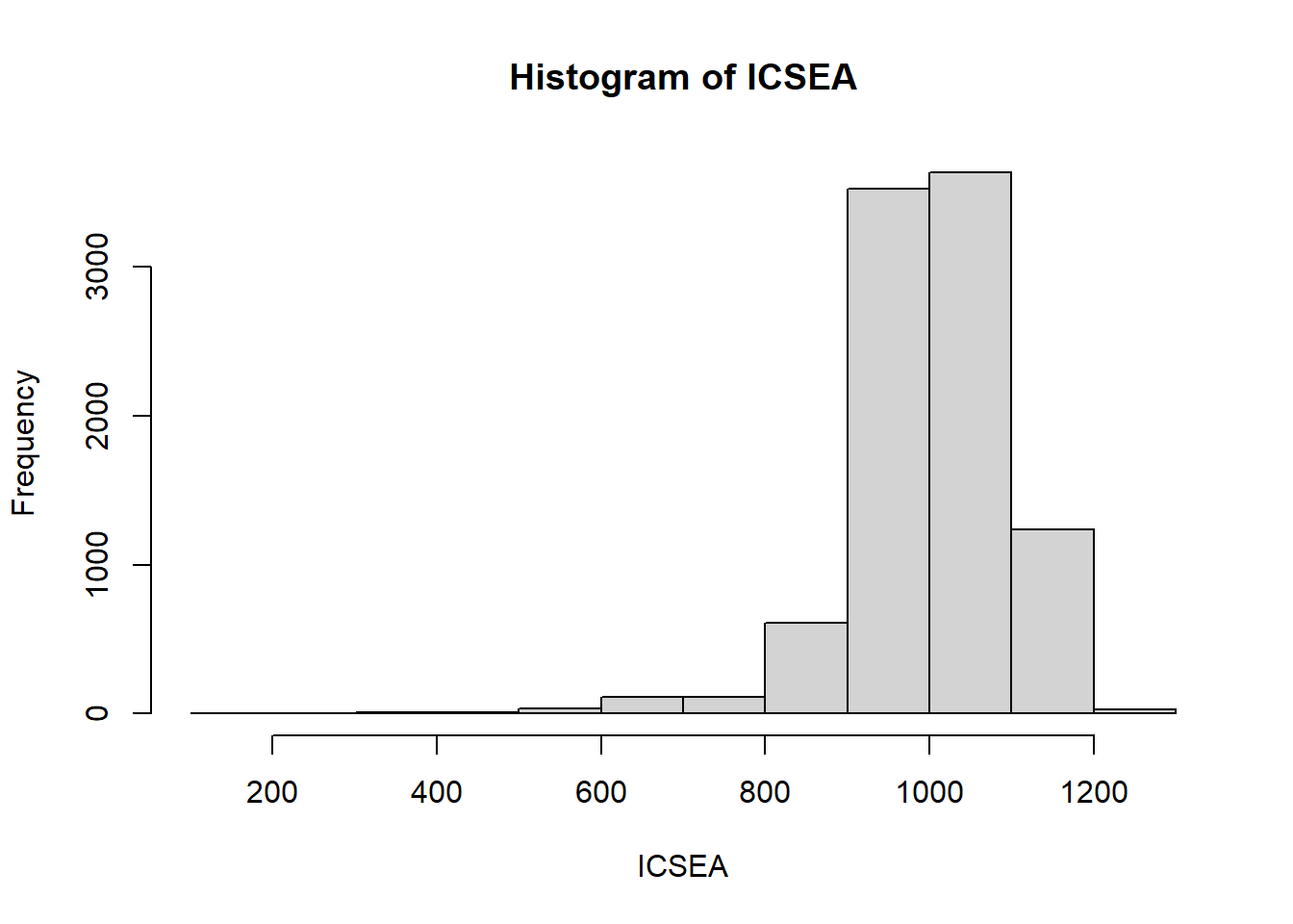
hist(ICSEA, xlab = "ICSEA", proba = TRUE, breaks = 50, col = 'lightblue')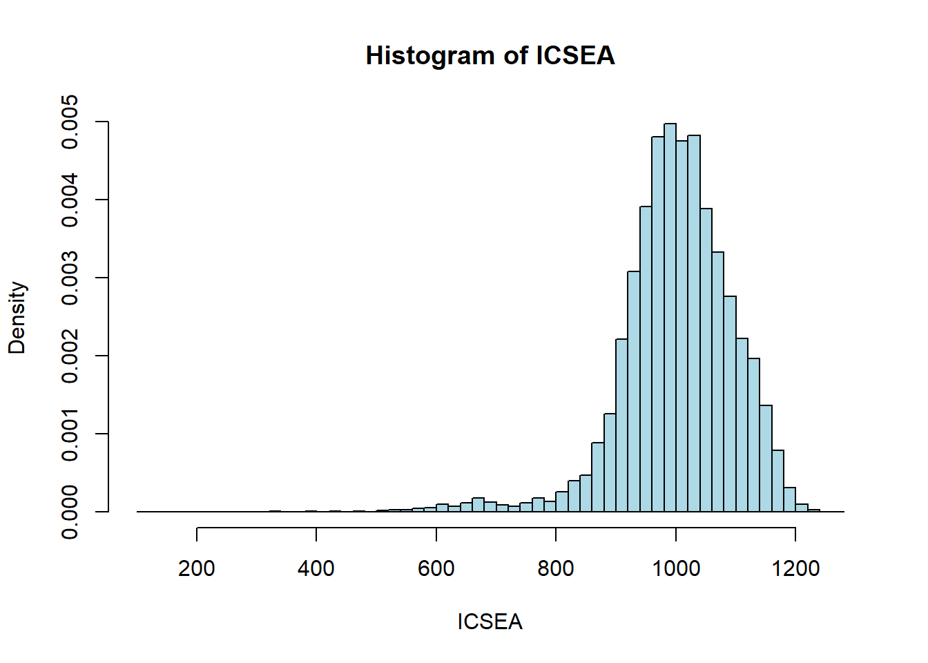
boxplot(decrease ~ treatment, data = OrchardSprays, col = "brown3")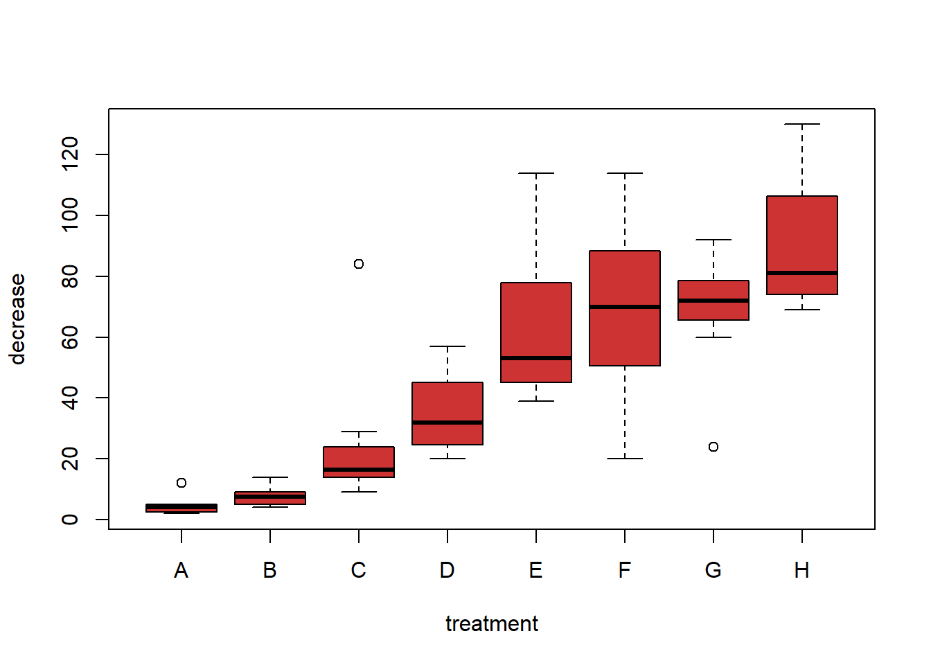
We will not delve far into this y ~ x notation in ACTL1101, but you will see more of it in later courses. It is a way of representing formulae for R functions.
my.col <- c('lightblue', 'lightgreen', 'brown3', 'purple1', 'lightgoldenrod1', 'pink', 'azure4', 'orange')
pie(table(school_data$State), col = my.col, cex = 1.75, main = 'Number of schools by state')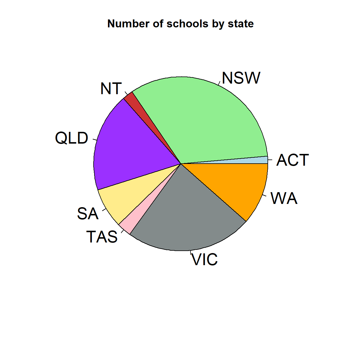
While pie plots are possible in R, you will find many people object very strongly to them. As always however, it comes down to the message you are trying to convey.
barplot(table(school_data$State), col = my.col, xlab = 'state', ylab = '# of schools')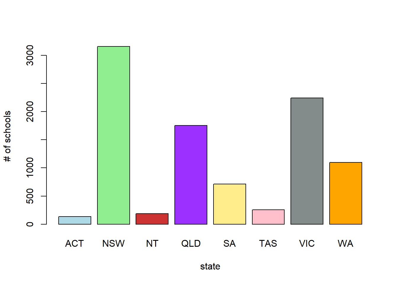
barplot(prop.table(table(school_data$State)), col = my.col, xlab = 'state', ylab = '% of schools')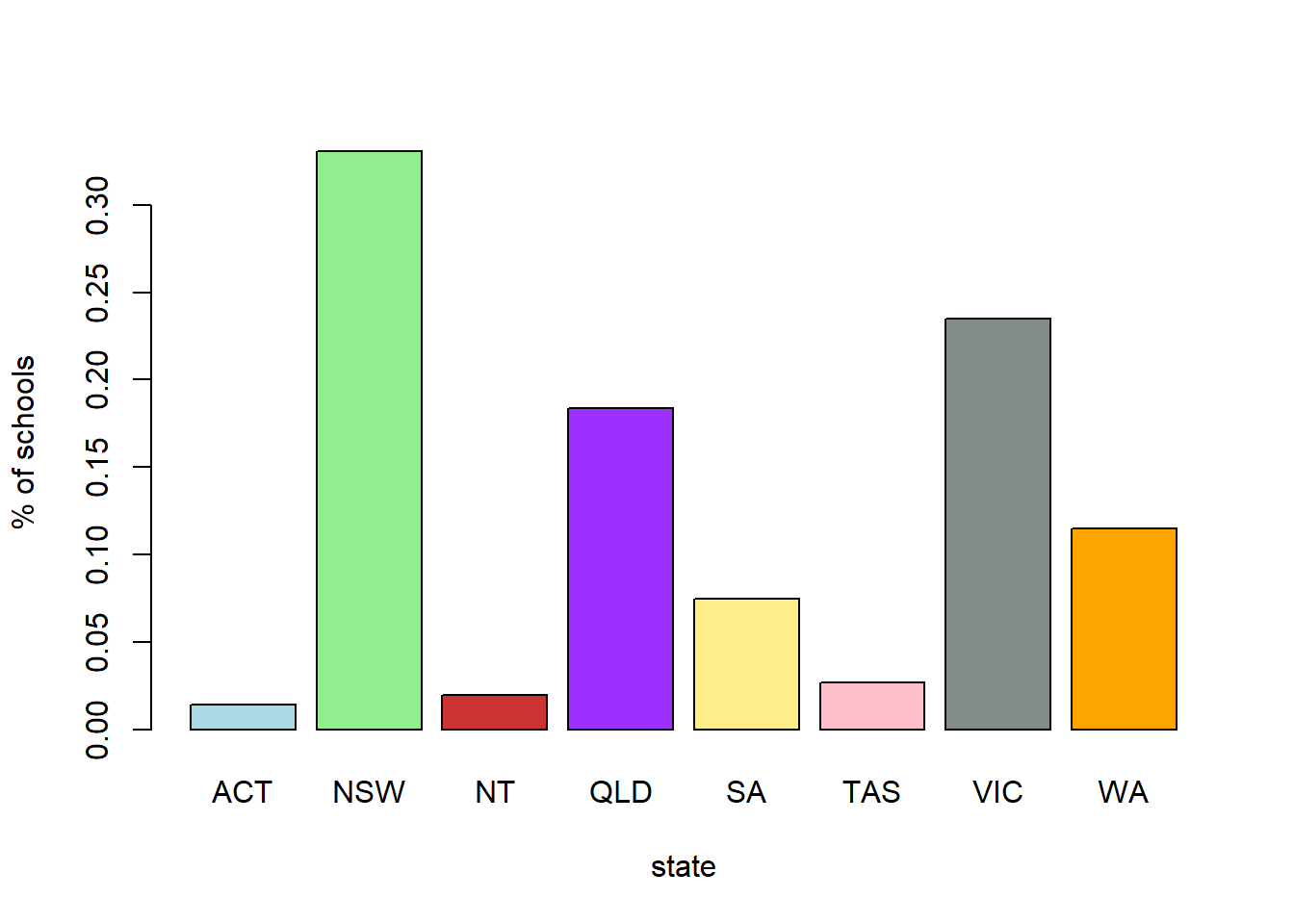
xlim or ylim to leave enough space for the legend# We create proportion tables (which are often more useful than raw numbers)
sector.by.state2 <- prop.table(table(School.Sector, State), margin = 2)
sector.by.state1 <- prop.table(table(School.Sector, State), margin = 1)
state.by.sector2 <- prop.table(table(State, School.Sector), margin = 2)
state.by.sector1 <- prop.table(table(State, School.Sector), margin = 1)
barplot(sector.by.state2, bes=T, legend = T, col = my.col[1:3], ylim = c(0,0.95))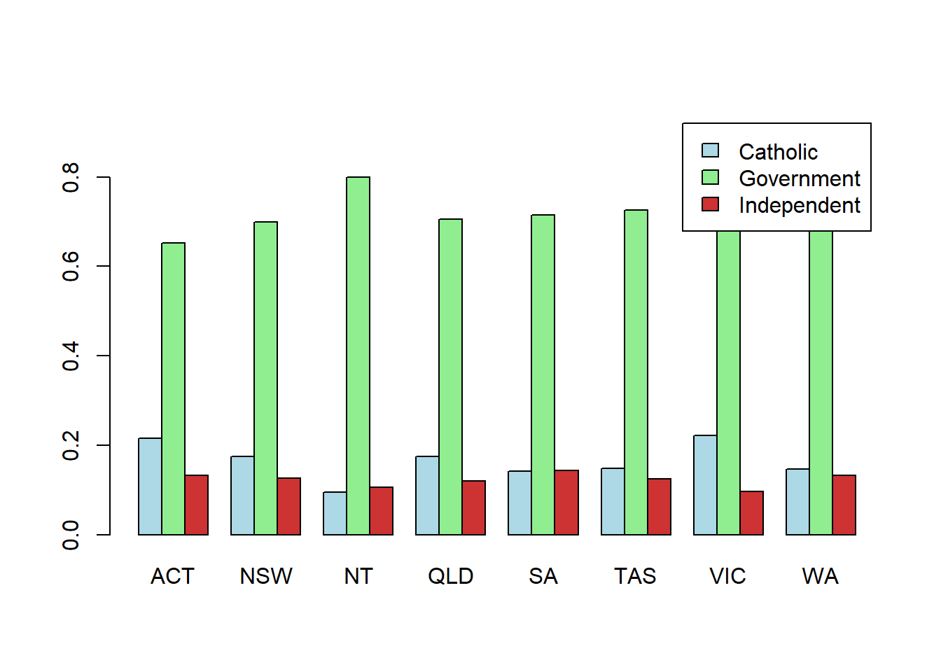
barplot(sector.by.state1, bes=T, legend = T, col = my.col[1:3], xlim = c(0,35))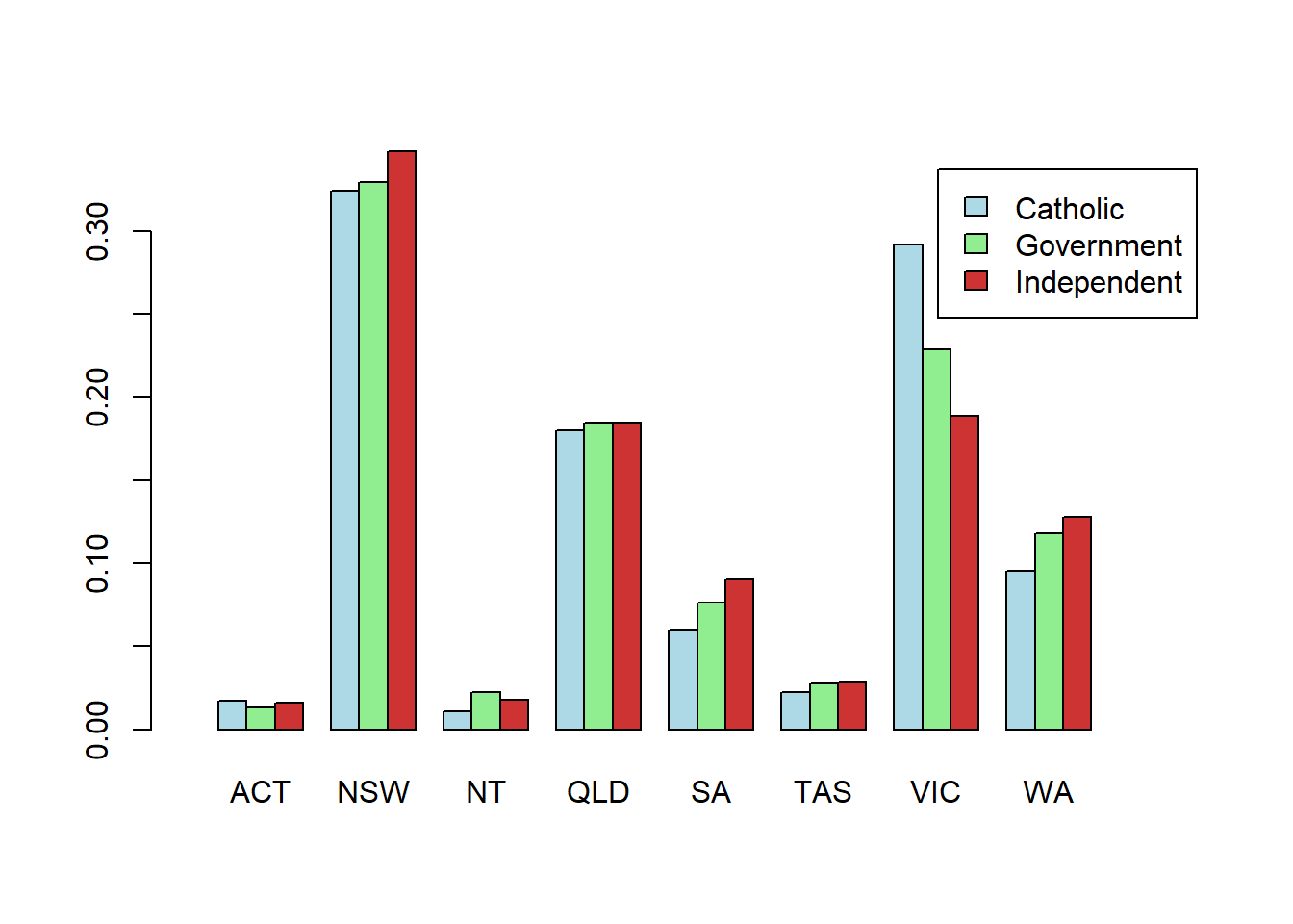
barplot(state.by.sector2, bes=T, legend = T, col = my.col[1:8], ylim = c(0,0.4))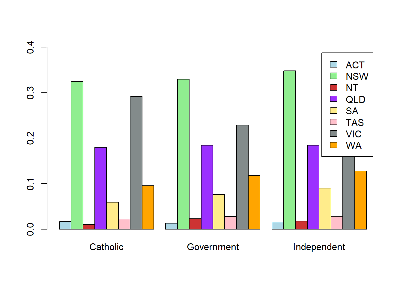
barplot(state.by.sector1, bes=T, legend = T, col = my.col[1:8])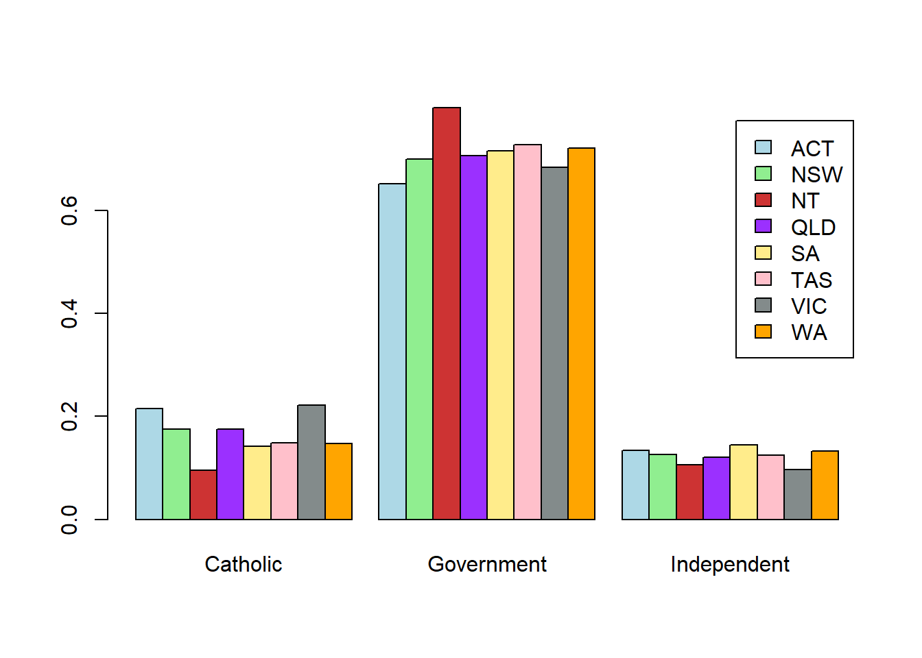
# stacked bars
barplot(sector.by.state2, bes=F, legend = T, col = my.col[1:3], xlim = c(0,13))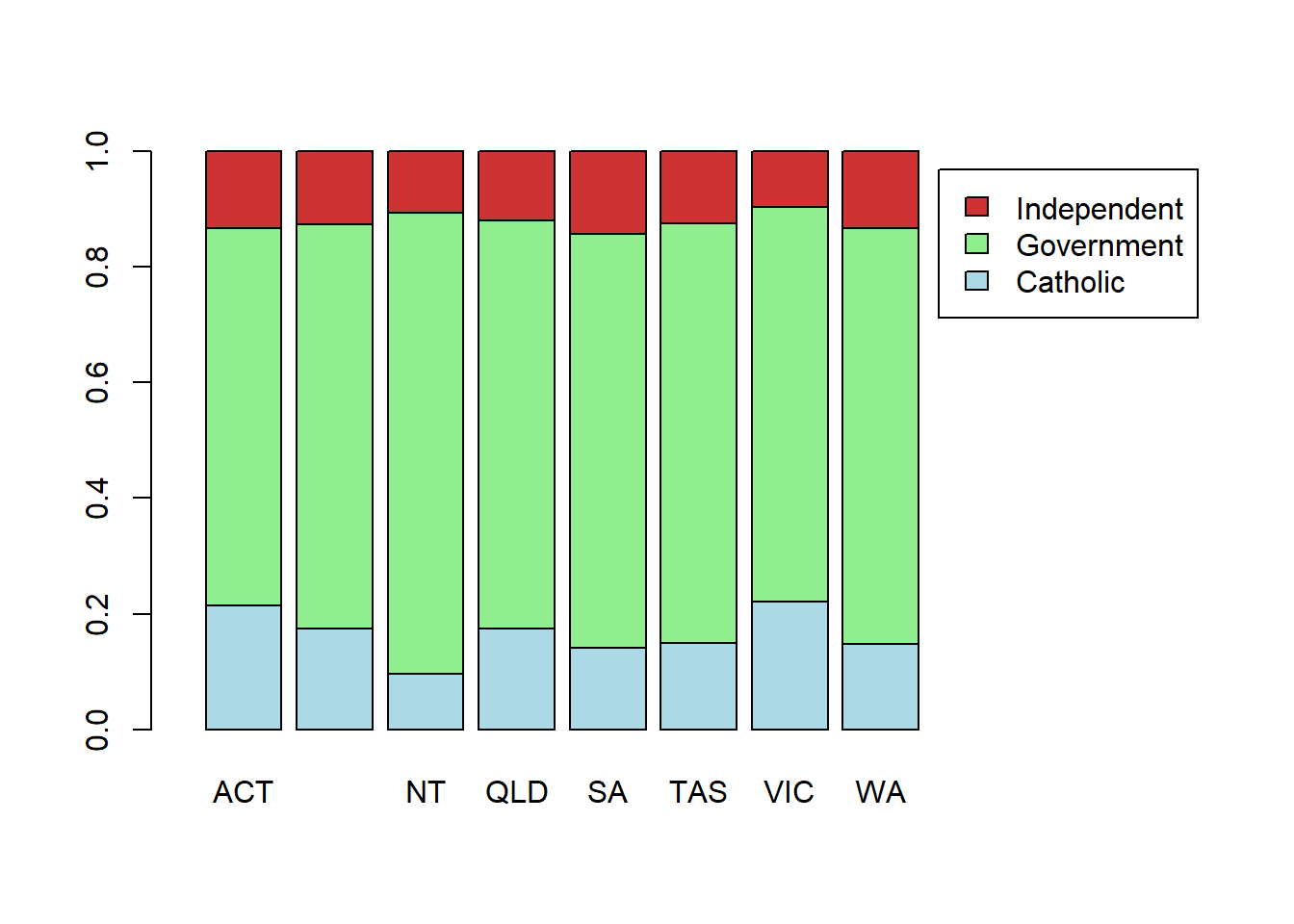
x) on the interval specified by the bounds from and tocurve(dnorm(x, 0, 1/5), from=-2, to=2, lwd = 2)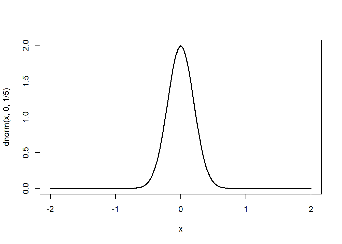
curve(x*sin(1/x), from =-1/10, to=1/10, lwd = 2)Warning in sin(1/x): NaNs produced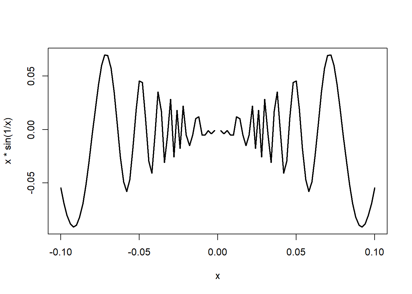
# with n=500 we raise the # of points at which the function is evaluated (better resolution)
# with cex.lab=2 we make the axis label bigger with
# with par(mar=c(5,5,2,2)) we change the margins of the graph
# the default is c(5.1, 4.1, 4.1, 2.1) (order: bottom, left, top, and right)
par(mar=c(5,5,2,2))
curve(x*sin(1/x), from =-1/10, to=1/10, col = 'brown3', lwd = 1, n = 500, cex.lab = 2)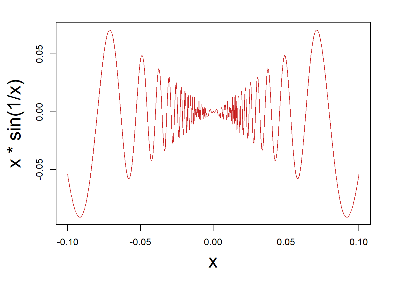
lwd (makes the lines wider if larger).You can easily have several plots (of possibly different types) in one plot, as below.
# Split the window to have 3 lines and 2 columns of plots (to be filled by column)
par(mfcol=c(3,2))
# First plot
plot(1:3,1:3,col="red",type="l", xlab= "", ylab= "")
plot(1:5,1:5,col="orange",type="p", xlab= "", ylab= "")
plot(1:7,1:7,col="blue",type="b", xlab= "", ylab= "")
plot(ts(rnorm(100)),col="purple", xlab= "", ylab= "")
curve(sqrt(x^2 - x^4), from = -1, to = 1, lwd = 2, xlab= "", ylab= "")
hist(rexp(100,1/2), main = "", xlab= "", ylab= "")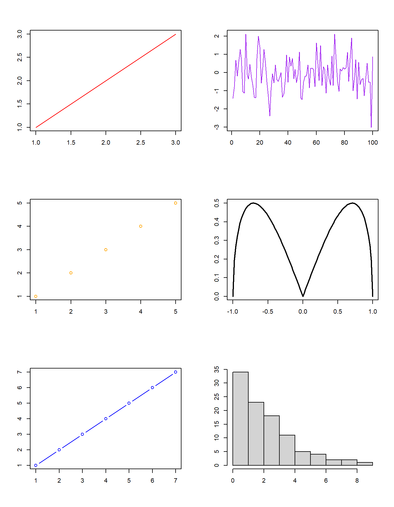
package ggplot2 is very popular (and powerful) to create ‘neat’ visualisations in R. Check out the visualisation below for an example. We will also provide an (optional) introduction to ggplot2 in a separate set of slides.library('ggplot2')
library('ggExtra')Warning: package 'ggExtra' was built under R version 4.4.3g <- ggplot(mpg, aes(cty, hwy)) +
geom_count() +
geom_smooth(method="lm", se=F) +
theme_set(theme_bw())
ggMarginal(g, type = "histogram", fill="transparent")`geom_smooth()` using formula = 'y ~ x'
`geom_smooth()` using formula = 'y ~ x'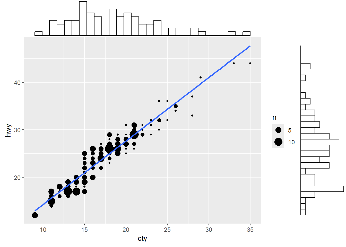
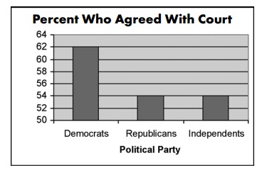
Consider this bar graph showing support for a policy among different groups of voters (USA). At first glance you’d think the difference between Democrats and Republicans is huge… but is it?
Even worse, consider the following chart… can you identify what is odd?
More examples here
Suppose that you would like to compare the sales of five teams. Is the following graph appropriate?
team.no <- 1:5
sales   <- c(100000,80000,60000,20000,120000)
plot(team.no, sales, type = 'b', lwd = 5, col = 'brown3',
     xlab = "team number", cex.axis = 1.5, cex.lab = 2)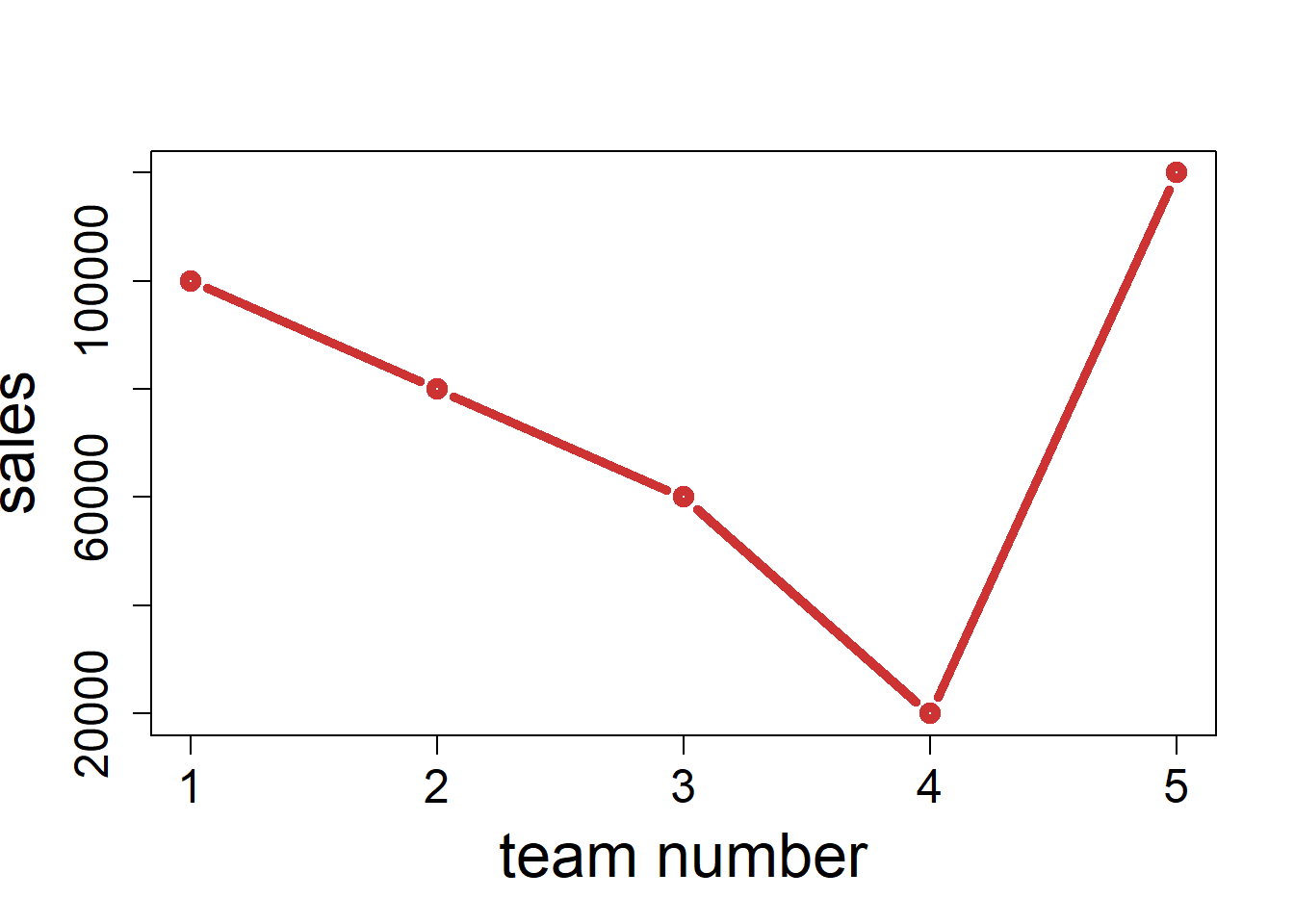
barplot(sales, names.arg = team.no, col = 'chartreuse3',
        xlab = "team number", cex.axis = 1.5, cex.lab = 2)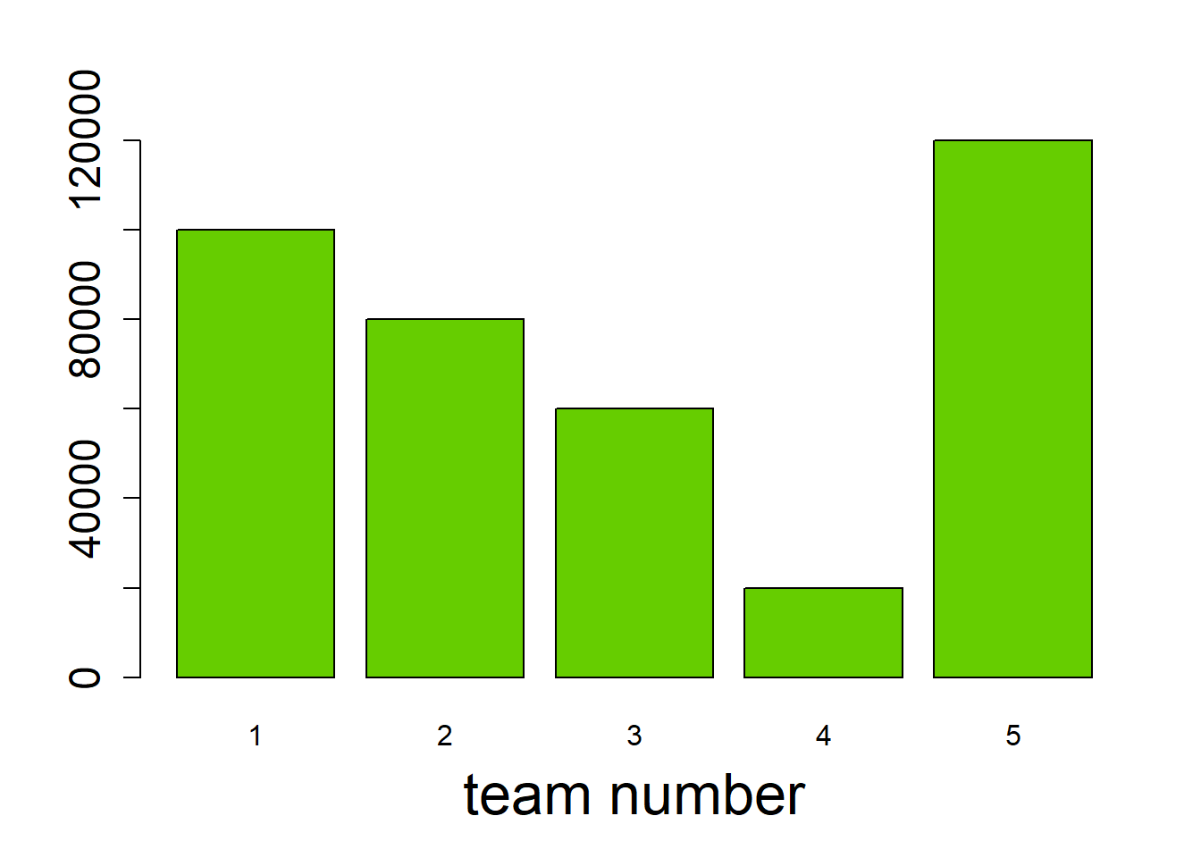
log() of the observations instead.library(MASS)
plot(mammals$body, mammals$brain)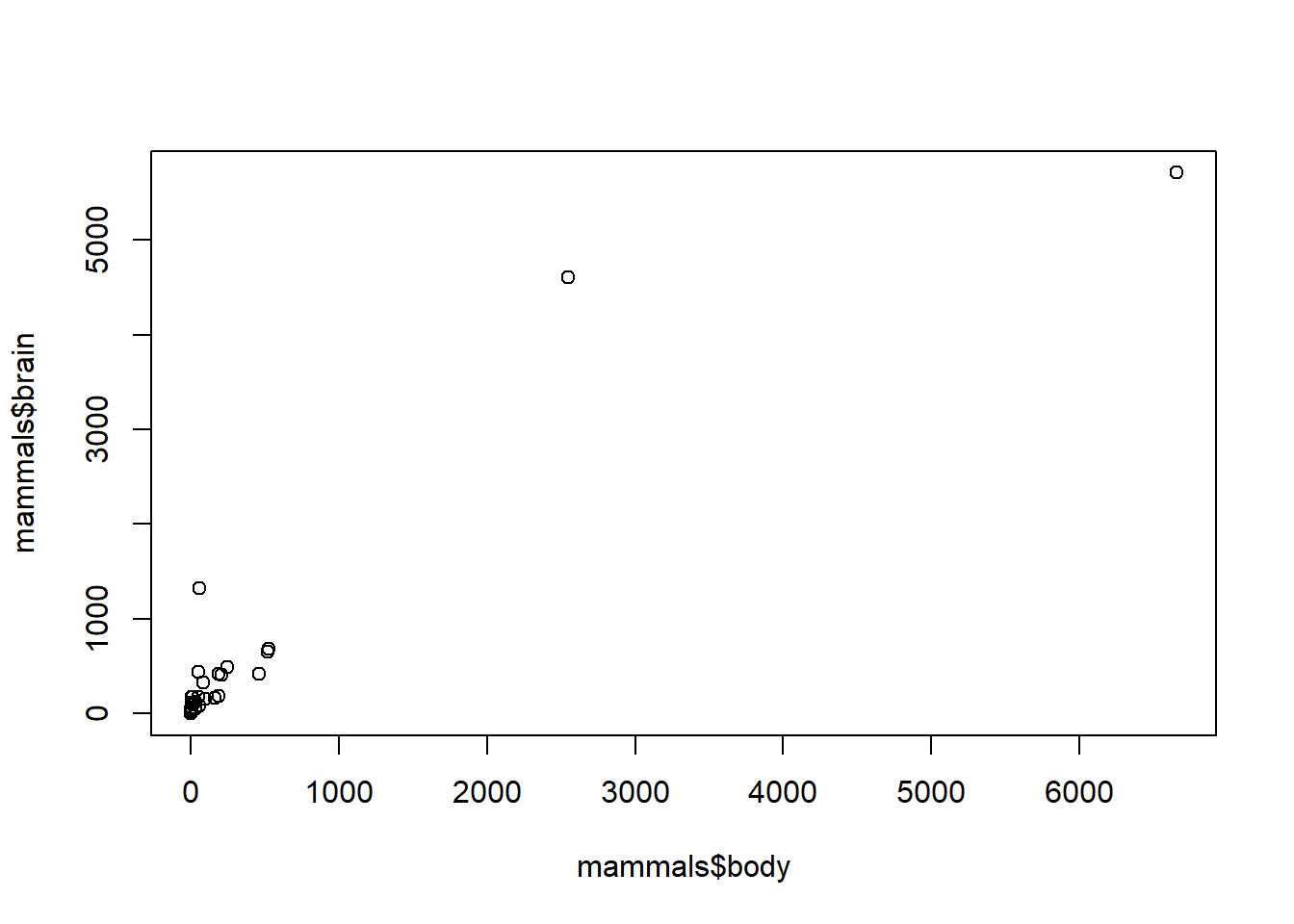
plot(log(mammals$body), log(mammals$brain),
     xlab = "log of body weight", ylab = "log of brain weight",
     main = "Brain weight versus body weight of mammals, on a log scale")
abline(lm(log(mammals$brain) ~ log(mammals$body)), col = 'red', lwd = 2)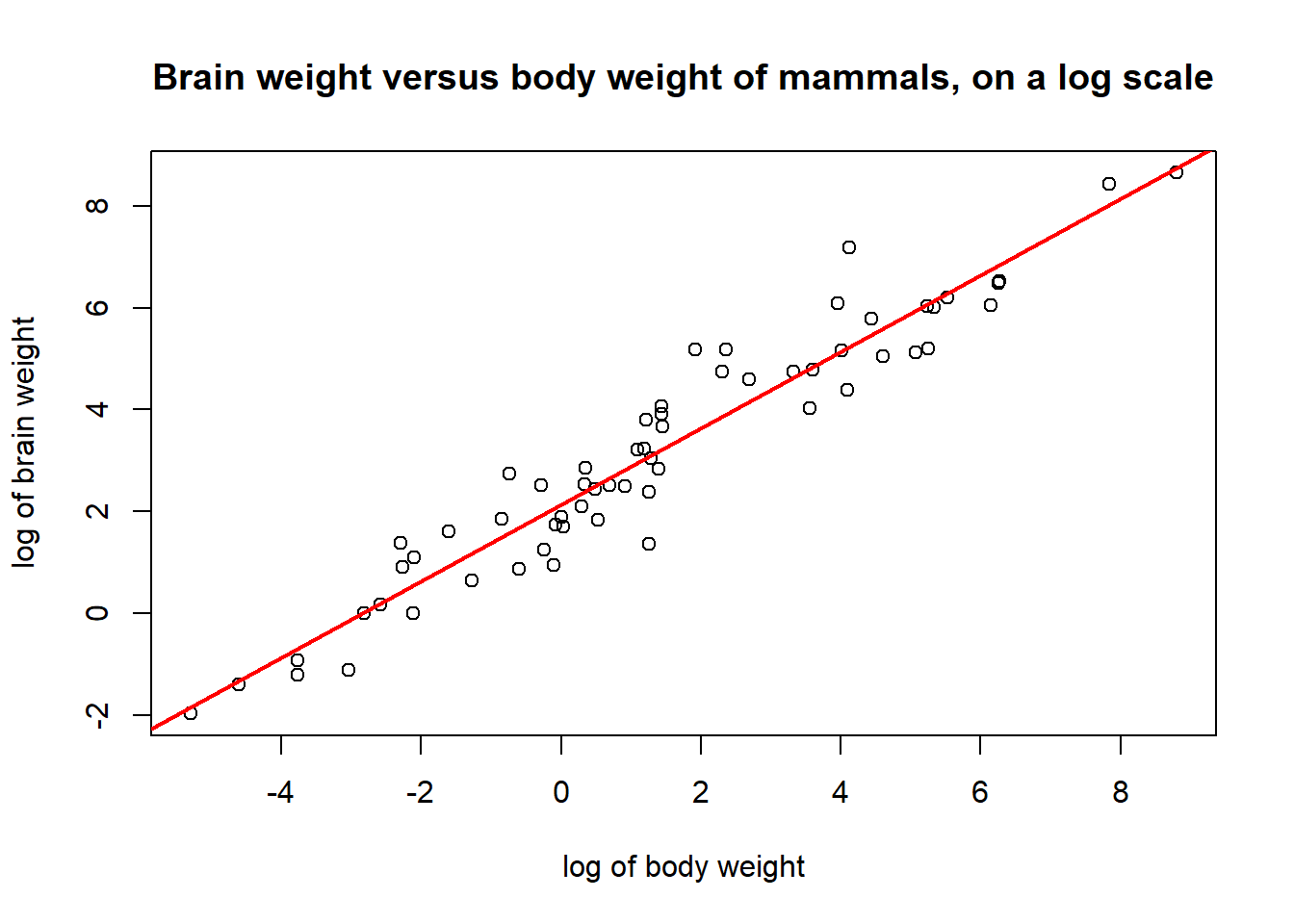
At this point in the course, you have gained familiarity with many “fundamentals” of R and programming in general.
You may have noticed (especially this week), that we sometimes don’t explain all the arguments and other specifics of certain functions. This is intentional.
A large part of being a proficient coder (and actuary, really) is developing the ability to self-learn new functions and packages and how to complete tasks you never tackled before.
Hopefully, you can use the remaining of the term (and beyond) to continue developing your ability to self-learn new R things.
Seatbelts’ dataset describes “Road Casualties in Great Britain 1969-84”.?Seatbelts command to bring up a description of the data in the help window.The dataset is a multiple time series, containing the following UK data for each month in the time period 1969-1984:
DriversKilled: Car drivers killeddrivers: Car drivers killed or seriously injuredfront: Front-seat passengers killed or seriously injuredrear: Rear-seat passengers killed or seriously injuredkms: Distance drivenPetrolPrice: Petrol priceVanKilled: Number of van drivers killedlaw: Whether seat belts were compulsory (1) or not (0) at a given month.We could use this dataset to try and answer the following questions:
Are there any more interesting trends we could draw from this dataset?
You may have noticed that it was hard to come up with questions without first knowing vaguely what the dataset looks like. Do some exploratory plotting to see what you can find. You should output at least 2 graphs.
[Hint: What is a particularly useful plot type for time series? What are other plot types that give a holistic overview of the data?]
Note that since the data is already a Time-Series data type (Check this using the str() function), the plot() function automatically plots a line graph.
plot(Seatbelts[,'drivers'], ylab = "monthly car drivers killed or seriously injured")

#Add a line to show when seatbelt law was introduced.
#Note here the dates in the x-axis are in decimal format,
#so we manually add line at January  1983 (last month of data with NO seatbelts)
abline(v=1983.0, col="red")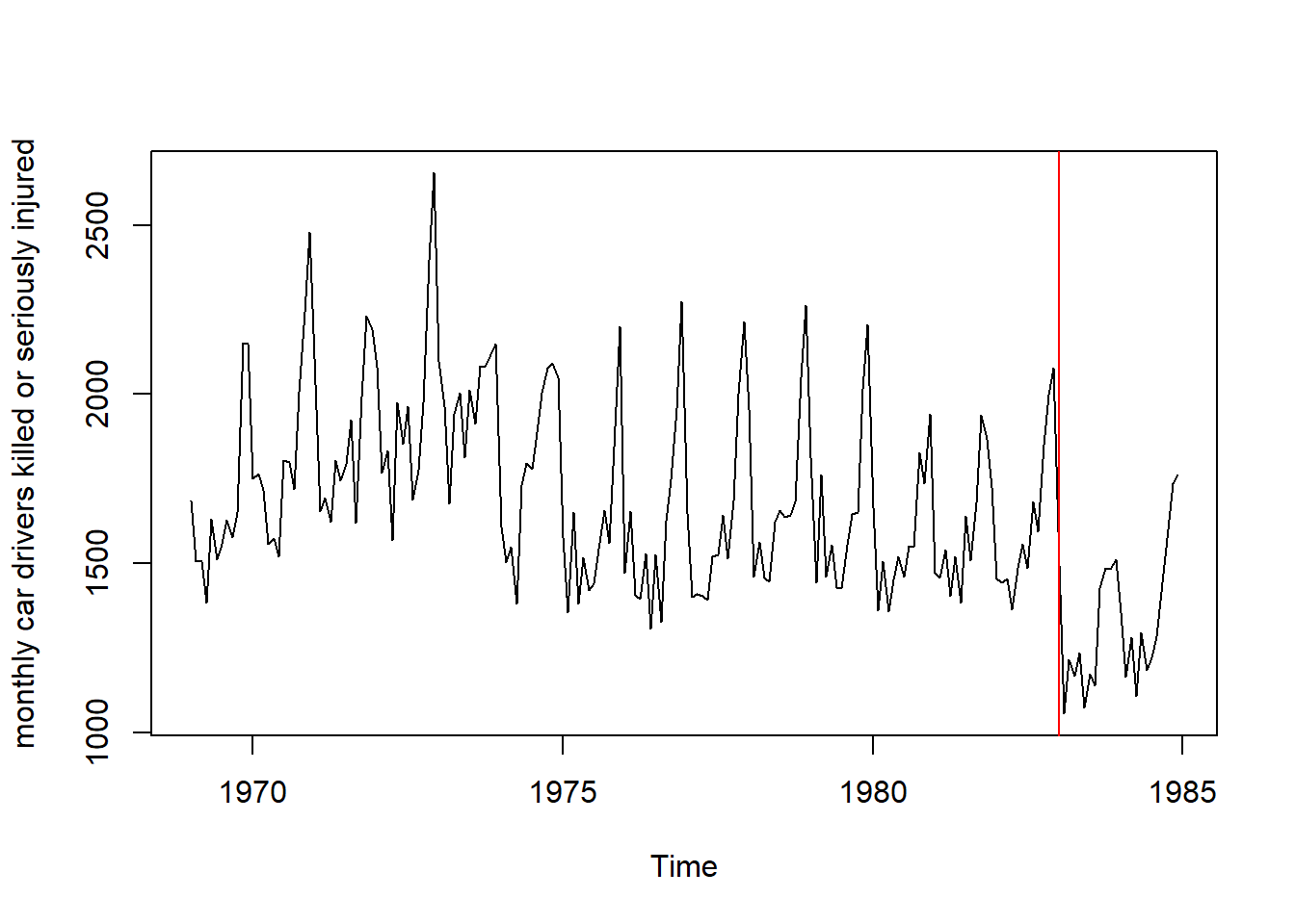
We see that after the introduction of the seatbelt law, there is a distinct drop in driver deaths. We can also see seasonal trends in our data (Why do driver deaths increase during certain months of the year?)
A histogram is also another good graph for general overview. However, note we lose the time aspect of our data.
hist(Seatbelts[,'drivers'], breaks = 30, col = 'lightgreen', xlab = "monthly car drivers killed or seriously injured",
     main="Histogram for UK (Jan 1969 to Dec 1984)")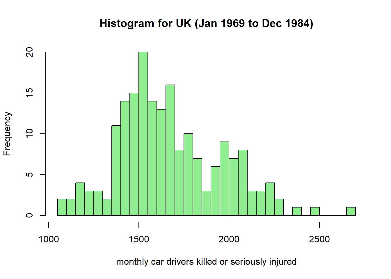
Do you think this distribution can be used for prediction into the future?
Let’s follow the story of the impact of mandatory seatbelt use on the frequency of driver death in the UK. Construct a box plot that compares the distribution of deaths before and after the introduction of the seat belt law.
# Boxplots of the two groups (before and after mandatory seatbelts)
boxplot(Seatbelts[,'drivers'] ~ Seatbelts[,'law'], xlab = "Mandatory Seatbelts: NO(0) or YES(1)",
        ylab = "Deaths & Serious Injuries", col = 'lightblue')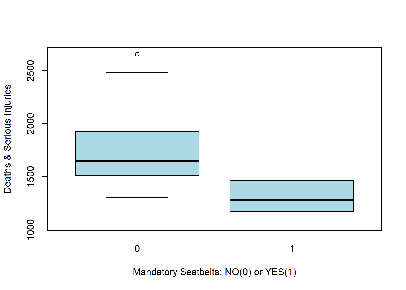
Thus it does seem like the seat belt law had a significant effect on driver deaths. But was it statistically significant?
We can give an approximate confidence interval on the mean number of deaths (by month), before and after the change in policy using dplyr.
# Note that to use dplyr we need 'Seatbelts' to be a data frame
as.data.frame(Seatbelts) %>%
group_by(law) %>%
summarise(mean = mean(drivers), sd = sd(drivers), nb = n()) %>%
# Add a variable for the lower and upper bounds of a 5% CI
mutate(ci.low = mean - 1.96*sd/sqrt(nb), ci.high = mean + 1.96*sd/sqrt(nb))
# A tibble: 2 × 6
law mean sd nb ci.low ci.high
<dbl> <dbl> <dbl> <int> <dbl> <dbl>
1 0 1718. 267. 169 1678. 1758.
2 1 1322. 200. 23 1240. 1403.Using the mtcars dataset:
wt by the mpg for cars with 4 cylinders using a scatter plotwt by the mpg to the pre-existing plot for cars with 6 cylindersUse the ‘iris’ dataset. Plot the average ‘Sepal.Length’ for every different ‘Species’.
Hint: dplyr!
prob=TRUE. Hint: argument add=TRUE from hist().curve() to add the two curves of the densities (a \(N(-3,1)\) and a \(N(3,1)\)) on top of the histograms.This exercise is a continuation of a previous’ week exercise. The dataset motor.df is accesible on Ed. As a reminder, this dataset contains some information about a large number of vehicle insurance claims, by policy. In Ed, the summary dataset summary.df has also been generated for you. Perform the following tasks:
Produce a visualisation of the distribution of variable GrossLossMotor across all policies using the motor.df dataset. What is a possible improvement that could be made to the x axis of this histogram?
Produce another visualisation of the daily numbers of insurance claims from the year 2006 to the year 2015 using the summary.df table. Make sure that this plot:
curve(x*sin(1/x), from =-1/10, to=1/10, lwd = 2, n = 500, col = "darkblue", xlab=expression(theta[i]), ylab=expression(y[i]), cex.lab = 2)
text(0, -0.05, "Fun with R", cex = 1.5, col = "purple")
text(0, 0.05, expression(y==theta*sin(1/theta)))
p <- 4
text(0, -0.075, bquote(beta[.(p)]), cex = 2)
mtext("Marginal text", side=4)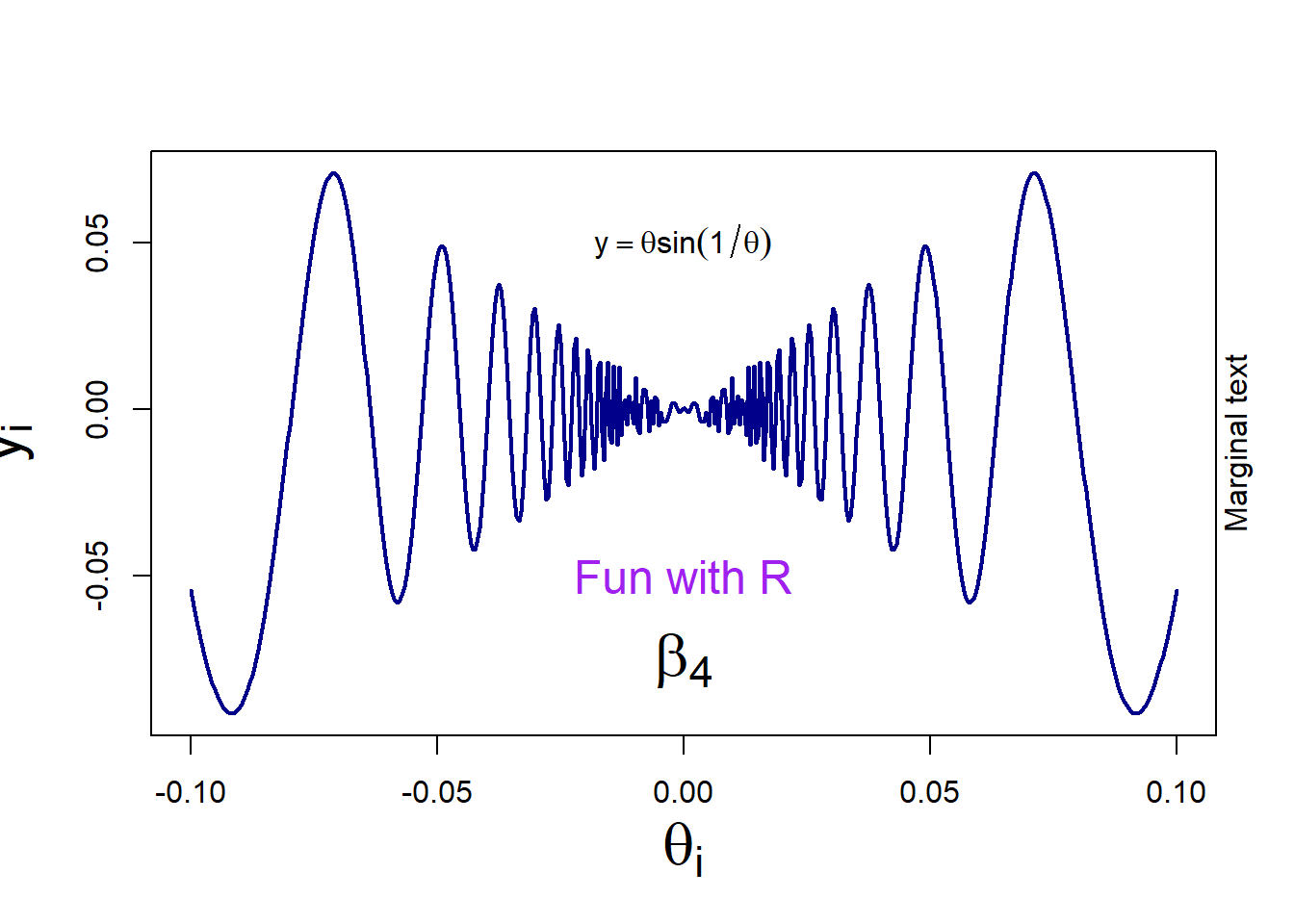
Notes:
cex allows you to change the size of elementsbquote is useful when your math expression is dependent on the value of a variable (here the value of p is displayed)To join points with straight lines on an existing plot:
# create an empty plot
plot(0,0,"n", xlab="", ylab="")
# add a segment joining two points
segments(x0=-0.5, y0=0, x1=1, y1=-0.5, col = "red", lwd = 4)
# add two segments, joining three points: first argument is the 'x' values, second is the 'y' values
lines(c(-1,0,1), c(-1,0.2,1), col = "blue", lwd = 4) 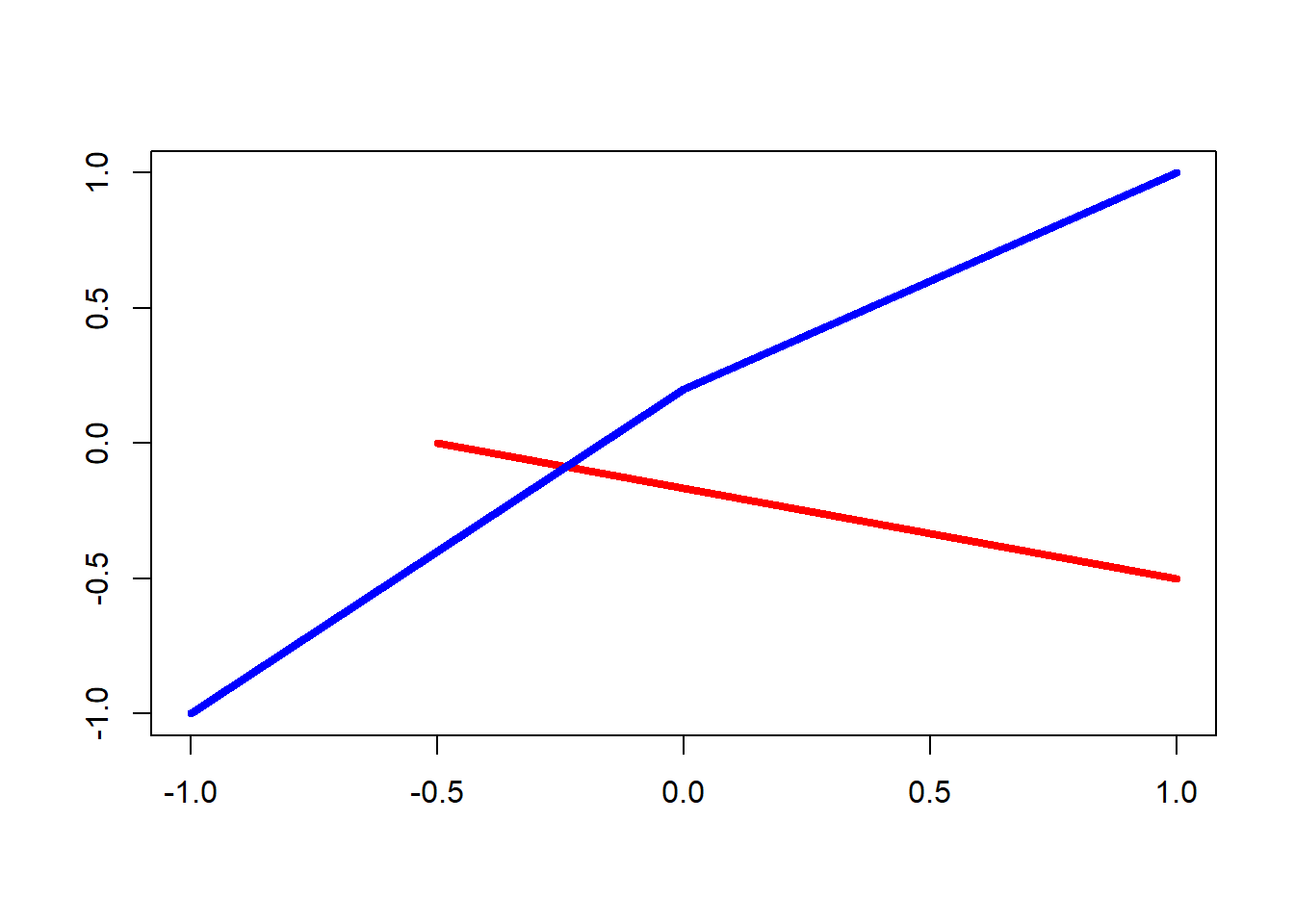
To draw a straight line of equation \(y=a+bx\) (specified by the arguments a and b), or a horizontal line (argument h), or a vertical line (argument v)
plot(0,0,"n", xlab="", ylab="")
abline(h=0.5, v=0, col = "purple", lwd = 4)
abline(a=1, b=1, col = "orange", lwd = 4)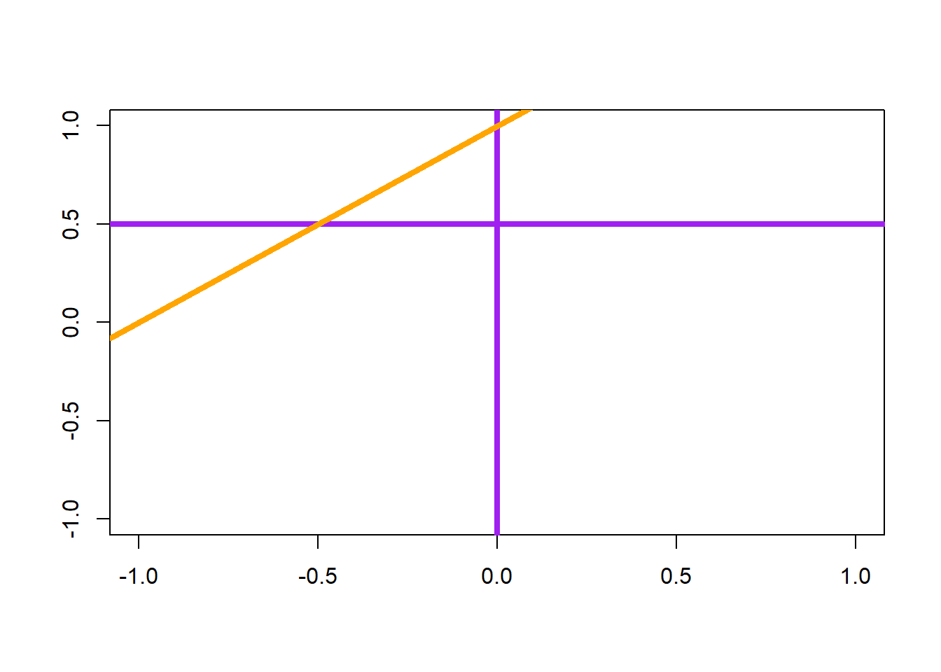
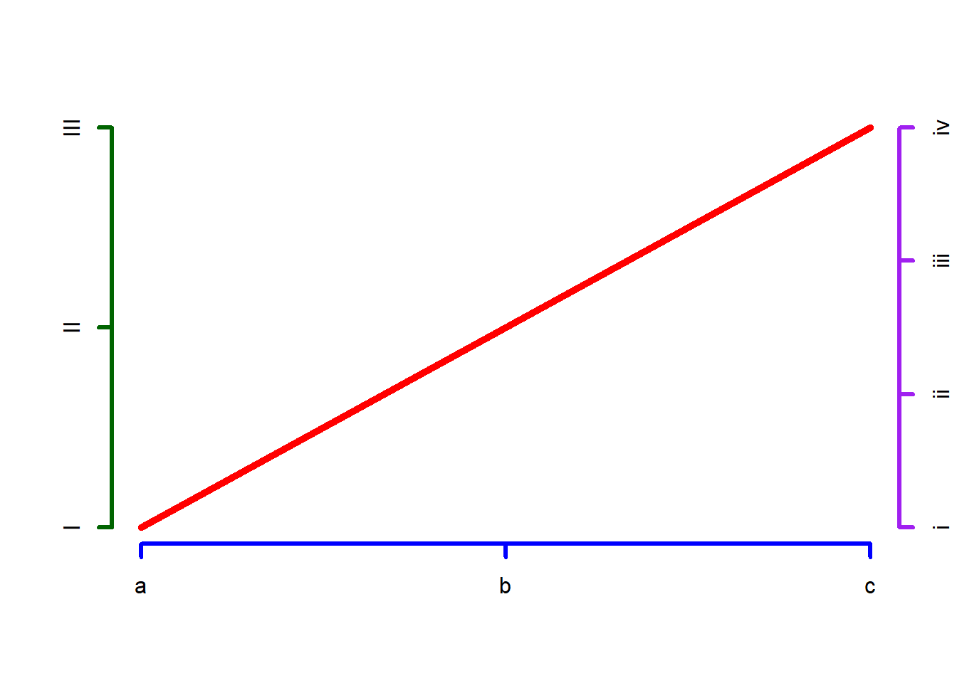
plot.new()
lines(x=c(0,1), y=c(0,1), col="red", lwd = 5)
axis(side=1, at=c(0, 0.5, 1), labels=c("a","b","c"), col="blue", lwd = 3)
axis(side=2, at=c(0, 0.5, 1), labels=c("I","II","III"), col="darkgreen", lwd = 3)
axis(side=4, at=c(0, 0.333, 0.667, 1), labels=c("i","ii", "iii", "iv"), col="purple", lwd = 3)